 |
|
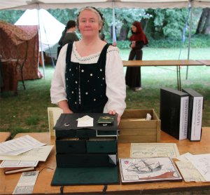
Printing and Manuscript Material
Given that I deal with words all day, and have been a publisher, in both electronic and print formats, for much of my mundane professional life, it's perhaps surprising that it took me so long to think about combining these skills with some of my SCA interests. It all began with a simple printed broadside (Dickon's Lament), and has gone a long long way since then. One of the things which really inspired me early on was the discovery of a great period-style font developed by Geoffrey Shipbrook (Jeff Lee). I have used his JSL Ancient font for a good deal of my period printed material, and will forever be grateful to him for his generosity and inspiration. I have done book-binding courses and have some equipment to support that, but have spent most of my time focused on printed and hand-written ephemera....so included here are the topics and links for manuscript materials as well, including items which mix both. There are also more printed material examples and discussions in my section on maps, as I'm using many of the techniques and tools across both areas. Main Printing MenuCOVID-19 Distraction: A Fateful Trip: the Caribbean Voyage from the Baskin-Kerr Archives
Manuscripts et alBeing a collection of handwritten or illuminated materials.
Research and Production: the backstage tour of the Caribbean voyage correspondence
The Style of Period PrintingI wrote this for an A&S class as a general introduction to the style of period printing and how to reproduce the look of late-period printing for use in the SCA context. If you'd like something you can print out for study or distribution, here's a PDF version. A very brief taste of printing historyThere are many and varied claims for the invention of printing. China gets the nod, as with so many things, for the oldest printed book, the Diamond Sutra of the fifth century, made up of woodblock pages. However, as with so many of those inventions, there seems to have been relatively little knowledge transfer outside the borders of the empire. This handout deals with printing in Europe from the 1400s onwards. Block printing was well established in Europe in the 13th century, primarily for decorating cloth. It wasn't a big jump to printing on paper, once that became readily available in the 1400s and soon everything from religious images to playing cards were being produced. Carving lettering and illustrations into woodblocks was not very efficient, and the blocks didn't last too long either. When Gutenberg and others started experimenting with movable type, that caught on because of the uniformity it made possible, and the flexibility and robust nature of the technology. The uptake of the technology was very very rapid and spread very quickly throughout most of Europe. Thanks to Gutenberg, from 1439 the Germans had the early lead, but by 1500, Venice boasted over 400 printers and had become a recognised powerhouse for elegant humanist printing which still commands attention and admiration. Aldus Manutius and Nicolas Jenson produced beautiful works in very high quality typefaces, and found a ready market in small format books and softbound covers. Printers in Paris, which eventually become a major centre, started up in 1470. Even the New World had a press operational in Mexico City by 1540, and the Spanish were printing in the Philippines in 1593. Gutenberg had been very nervous that his new approach would not find favour with the Powers That Be. So he did his very best to try to make his printed Bibles indistinguishable from the traditional manuscript ones of the day. He initially had large capital letters filled in by hand, but quickly developed the concept of two-colour printing. Pre-1500 works by Gutenberg and others are referred to as incunabula, as they formed the "cradle" of printing. By 1500, it is estimated that 1,700 printers, operating in 300 towns, had produced around 15 million volumes. Print houses saw a combination of artisan skills and enthusiastic marketing. Master printers were assisted by apprentices. If the latter learned Latin, they might aspire to become compositors, setting the type; or become journeymen -- literally spreading the knowledge as they moved from publishing house to publishing house across Europe. It was strenuous work, involving preparing the new oil-based inks, dampening paper, working the hefty presses (themselves said to be adapted from olive oil presses). Specialisation came early, with the printers working in tandem with booksellers, who always had their eye out for a successful pitch. Caxton's first print job in England was the Indulgence of 1476, which had gaps for the names of the purchasers to be written in. Like Gutenberg’s Bible, it was designed to look as if it has been written in blackletter. Latin grammars and instructional books were popular, and many books had lengthy prefaces extolling the virtues of a noble (sometimes unwitting) patron. Caxton has the credit for the first printed book in England, his own translation of a history of Troy; he also printed Chaucer’s Canterbury Tales. Woodcut blocks developed from fairly crude efforts into fine form, and engraving and etching allowed masters like Albrecht Durer to produce astonishingly detailed illustrations to accompany the poetry, prose and all manner of secular text that started to pour off the presses. Design aspects in use today developed early: page numbering, title pages, tabbed entries and indexes, pointy-hand or leafy dingbats. What didn’t change was the technology, not for another 300 years. Soon the presses were producing pamphlets calling for religious reformation, news stories of monsters and strange occurrences, accounts of tournaments, broadsides with the lyrics of popular or scurrilous songs. Life would never be as quiet again… Useful Exemplars for SCA PrintingSee the rest of this printing section for examples and further references. Broadsides/Broadsheets: useful approach for event announcements, flyers, advertisements etc Chapbooks: model for event booklet, ball cheat notebook, song lyrics Commonplace books: model for event booklet, personalised journals, recipe collections etc Festival book: possible model for an event booklet, especially for Crown events Music: for your singing groups Playbills: for theatre and other entertaining activities, advertisements or flyers Vade mecum (aka girdle book, belt book, folded book): for ball cheat sheets, event information Roundels: for use at feasts, High Table Making something look perioidMuch of what we print for SCA events would be regarded as ephemera – short-term forms of communication which are not designed to stand the test of time. This creates some interesting problems in researching period usage of such materials as they, too, tend to have been thrown away or recycled once their initial utility had passed. Many examples have only been found because of they have been recycled as pasted endpapers in books or somesuch. Consider the kind of document you want to produce – an event announcement, a playbill, a Ball cheatsheet. See if you can find examples, and get a feel for the impression they give in terms of layout and design. What kind of font/typography is used? While blackletter is the more common in period materials, for SCA use, it is probably better to go with a Roman font as many people have problems reading the more complex letter forms, especially in candlelight! There’s good reason why period printers quickly developed Roman typefaces or even imitations of humanist handwriting! There are lots of free fonts available. I highly recommend Geoffrey Shipbrook’s font set as a great late-period printing typeface. Pia Frauss has excellent fonts for a more handwritten look. Early printing in italic text often used non-italic capitals. It took a while for the idea of matched typefaces – and even capitals – to catch on. What orientation is the page? Is it landscape (horizontal) or portrait (vertical)? You can also change the familiar look and feel of modern page sizes simply by going for a different aspect ratio (the height to width proportions) – trim the page to make it narrower or, if you’re doing playbills or menus, lay out three copies across an A4 landscape page. What characterises the layout of the content? In period printed books, typically you’ll see large margins at the outside and bottom edge of the page; narrower margins towards the spine and often jammed tight up against the top. It can take a while to get used to this, as the modern eye is more familiar with a more symmetrical layout. The gutters (the internal white space between columns of text) tend to be narrower than we are used to, even filled with woodcut foliage. What characterises the graphic material? What is the paper like? What are the edges like? Main things to remember: You can go a long way to making something look more period with a suitable font, a couple of woodcut-style images and some non-bleached paper stock. References and ResourcesGeneral Info and Background Fonts and Typography Illustrations: woodcuts Paper Stock Conqueror Bond Laid: 100gsm Oyster: a good approximation for period weight/ colour, ($100/500), strongly grained and sized on one side so if you are folding it, take that into account Period ProofreadingI spent a year or so as a proofreader for an English-language newspaper in Japan, and was taught the rather arcane shorthand symbols used by Associated Press to indicate things like missing text and punctuation, lack of capitalization, bolding and the like. These symbols have changed only marginally since the very early days of printing, and Aldus Manutius and his brethren would have little difficulty in figuring out what was required from the marks in margins I have proofed (apart from the Japanese katakana iki replacing the still-used Latin term stet, for “let it stay as-is”).
Hellinga notes one early work of 317 printed pages includes 46 pages “with marks which anyone who has ever corrected proofs will recognised as proof corrections”; she mentions her “shock of recognition” and goes on to note that “some pages have as many as 30” (pg 104). Clearly a work which needed scrutiny. So when I came to undertake the rather large project of Lady Elizabeth Braythwayte’s Book of Physick, I found myself printing a proof copy of the numerous signatures that made up the tome and working my way through proofing them for all the usual errors. I made a point of marking up the proofs in ink as I decided early on that I would have the proof copy bound as an example of my work and also an interesting teaching tool demonstrating the process of printing. In Antwerp I had visited the printing house of Plantius-Moretus (now a brilliant printing museum), where the proofreaders had a set of comfortable bench seats, a large table and big windows to aid them in their task of poring over the masses of printed material that came from that venerable family. The firm employed three proofreaders alongside 20 typesetters and 32 printers working with 16 printing presses. It is clear from marks in various incunabula dating back as early as 1459 (Hellinga, pg 111) that proofing was something undertaken regularly and eventually regularised into a set series of symbols with associated instructions. It is not surprising that relatively little remains of early proofing materials as the proofed copies were unlikely to be kept – even if proofed work was bound, proofing is typically done in the margins of the printed sheets, making such marks liable to be trimmed off when the publication is ploughed to straighten the edges of the signatures. That said, there are extant printers’ copies with proofing marks from the 16th century across a range of printers working in Latin, Greek, German, Italian, French, Dutch and English, and some proof sheets have turned up within bindings or have been used for wrapping (as in the Plantius-Moretus house where type from the 16th century has been kept together with old proof sheets) (Hellinga). The first actual proofing manual was published just out of period in 1608, being the Orthotypographia of Hieronymus Hornschuch. Earlier work had been a bit a hit-and-miss, with early authors expected to turn up at the publishers and correct their own texts – a contract cited by Britannica and dated as early as 1499 makes the author responsible for such corrections. This did tend to encourage a highly individualised approach and lead to many dark comments about the lack of literacy amongst typesetters and others involved in the process. Lawsuits ensued from the 15th century onwards, and errata sheets soon made an appearance to try to correct the more egregious errors. It had clearly become an issue as in 1539, Francis I approved regulations requiring printers to “employ capable correctors...to correct the books with care and diligence” (McMurtrie, pg 12-13). In return, authors were exhorted to provide decent copy for the typesetters to work from, as scribbled text with complex corrections were considered as much a part of the problem as hasty typesetting or jobbing print firms. Hornschuch produced his manual with the aim of regularising production and eliminating errors, making books more useable (Cormack & Mazzio). Like many early proofreaders, he had an academic background, being a doctor of medicine, and familiar with a number of languages. Interestingly, although proofreaders were well established by then, the actual term “proofreading” only dates back to the 1930s (Lee).
| |||||||||||||||||||||||||||||||||||||||||||||||||||