 |
|
Other PapersFlags of Lochac [Family Papers] [Main Printing & Manuscript Menu] This is the section for other manuscripts and hand-drawn things I have done which don't directly relate to my persona story; the latter can be found in the Family Papers section. As I looked around for ideas of how to find 50 interesting things to print, I kept coming across others interesting items which would require some artistic capability. The trick was to select the things I could do and go from there. Here's what has resulted so far. Flags of LochacAS50 has been year of great debate on the nature and deign of flags. While the mundane country which forms the Crescent Isles argues over what is appropriate for us in the modern age, it was other instances of attempts at vexillological design that caught my eye.
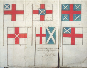
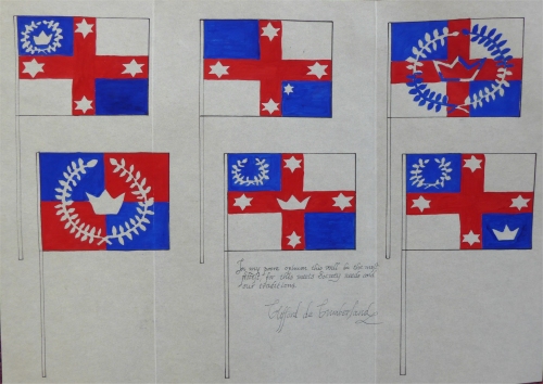
In 1604, when the nascent United Kingdom was in formation, there was probably an equally vexed debate about how to represent the new union of England and Scotland in flag terms. England had long used the cross of St George; Scotland had been tied to the saltire cross of St Andrew. Clearly a union of the two countries required some union of the flags, but how to do that in some for of equitable fashion acceptable to both sides? As Stewart says, “The traditional approach would have been to halve or quarter the flag between the two devices, but the problem was that whichever cross appeared nearer to the flagstaff, or on the top quarter, would be construed to enjoy a hierarchical precedence. Avoiding giving national offence was as important as coming up with an intelligible design.” A difficult problem indeed. The Earl of Nottingham, as Earl Marshal, clearly put his mind to it when he penned his comments on a paper representing various methods of combining the flag, noting under one of the six choices that: In my poor opinion, this will be the most fittest, for this is like man and wife without blemish one to other. This attempt to be even-handed wasn’t fooling anyone – with the English cross on the inside, it was clearly the dominant male in the relationship, which the Scots were never going to accept. As it happened, none of these designs were selected, and it took another two years before the now-familiar Union Jack was promulgated by Royal Proclamation. Having the English cross superimposed on the Scottish did not go unremarked upon, nor uncriticised – the Scottish shipmasters protested that it would “breid some heit and discontentment betwixt your Majesteis subjectis” (Stewart), but it remains to this day. The 1604 sheet showing the designs seemed like a very good model for representing, in a very-close-to-period fashion, the equally protracted debates that swirled around the various designs proposed for the Kingdom of Lochac. Most of them were variations on a theme, particularly that of the long-ago Kingdom of Cumberland (a group which predated the SCA in Australia). Of the many designs considered, I selected six, painting them in gouache on parchmentine measuring 290mm x 425mm, the same size as the original. It has been creased to match the original as well. Of the central two designs, the upper is the Cumberland design, the lower the one that was eventually selected for the new Kingdom. As it was proposed by Reyardine de Clifford, I thought it mete to represent the heritage by having the comment signed by Clifford de Cumberland: In my poore opinion, this will be the most fittest, for this meets Society needs and our traditions.
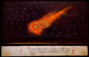
References Comets and HailstormsI wanted to cover a series of events in broadsides, inspired by Chapman’s 1596 landslip pamphlet, so began investigating how natural disasters and related phenomena were reported. While trawling the murky waters of the Internet I started to come across references to the wonderful Book of Miraculous Signs, published probably in Augsbug in the 1550s (eg the 1527 comet image on Deliyannis’ blog). It turns out that German art publishers Taschen put out a lovely facsimile of the book, reproducing 158 of the original 160 images, smudge marks and all. The Book consisted of a series of coloured gouache and watercolour paintings depicting a whole series of unusual phenomena – comets, hail storms, monstrous births and the like, a sort-of Fortean Times of its day. Short captions under the paintings provided information on the various events. Despite the inclusion of much Biblical imagery, the natural phenomena tended to be reported on very straightforwardly, lacking the usual “interpretation and moralistic admonition” (Warner). I investigated various images online and decided to do versions of two of them: one based on the 1456 and 1527 comet paintings and one of a huge hail storm experienced in 1552. The Comet
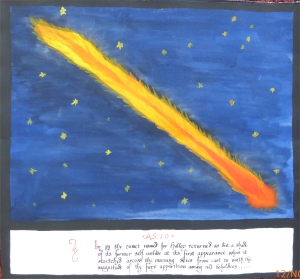
Comets have long been referred to as hairy stars, and the 26 examples depicted in the Book certainly take that into consideration, with positively fluffy comets barrelling through the sky, spiky tails streaming behind bright globular heads. There are some suggestions that the 1527 one may, in fact, have been an auroral display (see Deliyannis’ commentary on the Creutzer report), as it was said to involve “many streaks like long spears” with pale red daggers and “flames of bright and fiery hue”, “as if in flowing water streaked with blood”. I decided to base my cometary effort on Halley’s Comet as it’s one I’ve actually seen and written about in two astronomy books. The image was based on the photo taken at Meeanee Observatory in Hawkes Bay during the 1910 flyby (Hyde, pg21), much more impressive than the fuzzy blob I saw through the Townsend telescope in AS20 (1986) on it’s later return. The caption description is partially based on a report printed in the Christchurch Press on 19th May 1910 (Hyde, pg112).
Hail from the HeavensThe other natural phenomenon that caught my eye was the "terrible storm of hail' depicted as pounding Dordrecht in 1552. It was so powerful that people thought the Day of Judgement was coming, but after half an hour, the hail let up. Some of the stones weighed several pounds apiece and, oddly enough, the caption says that "where they fell, they gave a frightful stench". Sydney is well known for its horrendous hail, with one storm on 14 April 1999 dropping 500,000 tonnes, causing over $2 billion in damage, with holes through roofs and cars, planes and helicopters badly dented. There were 50 injuries and one fatality from the related lightning. This seemed like a good event for an excerpt from an SCA Book of Miraculous Signs. References Darnley Poem
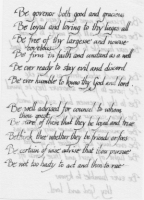
This is a piece of handwriting practice in humanist style. Next time I should choose something which has more than one capital letter! The poem is a piece of advice which Henry Stuart, Lord Darnley, penned for his soon-to-be wife Mary, Queen of Scots. The sentiments are admirable -- if only he'd followed them! (Antonia Fraser refers to the item as priggish, which is also a fair reading; not many people have much time for Darnley.) I like the way the writing shows through the parchmentine, though, thinking about it, I should have used a folded piece of paper. I did read somewhere that this was far more common than single sheets through to the late 1600s, though that might have been with regard to letters when you wanted the extra page to form part of the outer covering in lieu of an envelope.
| |||||||||||||||||||||||||||||||||||||||||||||||||||||||