 |
|
Garb and AccessoriesA&S Challenge Garb and Accessories Garb:
[The Lotto Dress]
[A Painted Forepart]
[Laurel Robe and Pelican Cap]
[Turkish Venetian Coat]
[Venetian Chemise]
[Apron]
[White Doublet, Black Bits]
[Jupon]
[Flat Cap]
[Sleeve Insert]
[Velvet Sleeves (period favour)]
[Elizabethan/Kiwi Coif] Jewellery:
[Our Coronets]
[Tudor Jewellery]
[Durer Necklace]
[Mary Queen of Scots Rosary]
[More Rosaries]
[Mary Queen of Scots Earrings]
[Hat Jewel]
Other Accessories: [Flag Fans] [Belt and Rosary] [Zibellino] [Pomanders] [Venetian Betrothal Goblets] [My Cup] [Ballock Pouch] [Ballock Dagger] [Parade Shield] I'll cheerfully admit it - I am not a garb fanatic. I tend to spend most of my time doing other things, which explains why I've had virtually two chemises and two basic outfits for the past 20 years. (I figure that suits a Borderer in any case...though I tried to upgrade it so as not to be a scruffy baroness.) I'm hoping to slowly improve my costuming, but it's not high priority. In the meantime, here are the garb items which I have put some considered work into. The Lotto Dress
When the good folk of Ildhafn offered to make me a dress in exchange for some standards I leapt at the chance. Little did they know that I had my eye on Lorenzo Lotto's Lucrezia dress... The timing of the offer was perfect as I'd had five metres of peach-coloured velvet waiting for it for some years and I had just decided to get rid of it, having come to the reluctant realisation that constructing the dress was clearly way beyond my capabilities. The dress appealed to me because the painting was done in Venice in 1526, making it just the right time to have been something my mother may have worn. I aim to produce a batch of items suitable for her wedding cassone. It also has what I am told in Ildhafn is now referred to as "katherine green". Mistress Katherina and Lady Caterine de Vantier took measurements, and made up a kirtle to get the pattern perfect, and then they set to...118 pieces later, and sewing that apparently involved much of the Barony of Ildhafn, and the Lotto dress was finished in all its glory.
I got to parade the dress at Canterbury Faire's Ball (AS45), and it felt very very swish. It's my first really pretty fitted frock in almost 30 years of playing. I love it. A Painted ForepartI wanted to make something suitable as an item of peerage clothing, having admired the cloaks and other items that seem common eslewhere in the Known Worlde. And I had the idea of modelling something on the Hardwick Hall portrait of Queen Elizabeth. So when a Kingdom A&S category for silk painting came up, along with a friend's elevation to the Order of the Pelican, it seemed like the right time to produce something. Bear in mind that you may copy and examine things done by other good masters; that it is no shame to you. Most painted cloths that I can find reference to were produced on finely woven silk (sendal) or linen (sindon), but these generally refer to painted banners or hangings, as a less expensive alternative for tapestries. Clearly paint was used on clothing, usually of a special or one-off nature, as the English Wardrobe accounts for 1347 mention painted tunics, cloaks, crests and masks for that year's Christmas festivities and there are other mentions of painted garb over the following 200 years (Gordon, Levey pg 74-75). For some time, I have been intending to make a forepart along the lines of the skirt and stomacher shown in a late portrait of Elizabeth I, painter unknown, that I saw on display at the end of the Long Gallery at Hardwick Hall. A significant time spent staring as close-up as I could get did not resolve the still-unanswered question as to whether the forepart was painted or embroidered. Most of the references I have seen generally consider painting more likely (Swain, Levey pg 36), and from the nature of the subject material I'd cheerfully agree with that.
Having determined that painting a piece of garb to be worn could be argued as reasonable, I decided that I would like to make the subject material significant to me, though comparable in style to that of the portrait. Lochac does not seem to have any tradition of peerage clothing, such as individual cloaks, but a forepart with a pelican as the centrepiece would make a nice variation and something special I could wear for elevations and other Order-related activities. The original skirt is thought to have been painted on white satin (Levey, pg 36). I've done a lot of silk standards, and have silk readily available, so that, and the motivation of the Kingdom A&S category of silk painting, saw me decide to use a suitable length of 8 mompe silk I had available. It's a little lighter than I would have preferred for clothing, but the low-frequency use the forepart is likely to get means that it should last adequately despite its thinness.
Backing it with a piece of cotton drill helps in this regard as well as providing additional contrast for the painting. It also meant I could pin it to a plain underskirt - I had no intention of reproducing Elizabeth's hoop skirt as it's about 30-40 years too late for me and far too fancy. The hem includes a line of braid very similar to that on Elizabeth's skirt, with a set of piping, rather than what appears to be pearls along the bottom edge. It works well with my formal overskirt. I am still considering whether to add some beading or silk stitching to hold the silk to the lining. Levey points to embroideries that had been embellished with paint, so it would be reasonable to embellish the painted silk with beading and stitches. TechniqueThe 15th-century Italian artist Cennino Cennini produced a reference text, Il Libro dell'Arte (The Craftsman's Handbook), which provides instructions for painting on linen or silk. He worked with gesso, glair and tempera, as well as gold leaf, drawing his outlines in charcoal, then later inked them in using a fine "minever" brush to produce shading and shadows. This approach is detailed in his text, particularly Section 162 and 164. His primary purpose, like many painters and stainers, was the production of banners and hangings, rather than clothing. Like Cennini, I stretched the silk on a frame, pencilled in the subject outlines, then painted them in and used a fine brush to add shading and additional colours. Unlike Cennini, I did not use a size on the silk. I had come across information on how to produce an egg-white based size to do this shortly before starting the project (Company of St Luke/Destrier)., but decided against it for both cost and timing reasons. I would be interested in trying this out at a later stage.
I used Fastex textile ink (acrylic) and Setacolour fabric paint, as I required a medium that was readily available and which could be rendered colour-fast. Its nearest period equivalent in this context would be the tempera Cennini used, as it produces a similar matte opaque covering which shows relatively little in the way of brushstrokes unless intended. Initial testing with Dharma Pigments, which I have commonly used for silk standards, suggested that their use with Setacolour fabric paint was not ideal - unlike the Fastex acrylic textile ink, the Setacolour did not appear to provide a reliable resist, or possibly not a reliable resist at this more detailed scale. Fortunately, as this forepart was going to be backed with cloth, the use of opaque paints was not an issue; they were something I would normally avoid when making standards, as you need to be able to see the colours through the cloth when flying. Unlike the banners and standards that I have done, this forepart does not have black outlines around all the elements. Rather I matched the acrylic to the colour of the item or used an outliner. This worked particularly well in using the pearl shimmer Setacolour, as that gave an additional outlining and colour contrast vital for the many white elements in the item to give them shape and make them stand out from the white fabric.
Elizabeth's dress is painted along these lines, with a fairly naturalistic approach to the water monsters and flora that make up the bulk of the items. I dithered for some time as to whether I should try to match the painting style, but the technique was beyond my capability and the subjects I wanted to use did not lend themselves to a direct copying of the style, particularly in the use of a ground "compartment" for most of the elements. As it is I have a mix of naturalistic and semi-abstract subjects. The painting was quite a challenge, both in technique and basic capability. I find it hard to judge if I have really achieved the level of detailing and control I would like to -- cataract surgery means I have no depth perception and a different fixed focus in either eye, which makes closeup work a matter of guesswork at times! That and the use of a very small 00 brush meant that I could only do one or two elements at any one time before either my eyes or my patience gave out. SubjectsMary Queen of Scots and her contemporaries were well-known to have taken embroidery designs from emblem books and works on natural history, so it seemed reasonable to do the same for some of the source material for this forepart (Swain, pg 65-72, Levey pg 50-52).
The Chartley Inventory, made in 1586, included descriptions of needlework belonging to Mary (Swain, pg 90-92). The subjects included roses, arms, thistles, a lion, flowers and Mary's personal cipher. The Oxburgh panel embroidery known as the Marian Hanging includes her cipher, a pelican, a lion, bees, butterflies, and a sun in splendour (Swain, pg 101). The Hardwick Hall portrait of Elizabeth includes lilies, heartsease, a swan, butterflies, white roses, lizards, snakes and other creatures (Levey Fig 28, pg 36). I decided to use similar emblematic depictions of items important to me in the SCA and to my persona. Around the hem are white roses for the House of York, the white boar badge of Richard III, my white tower of the Hermitage, and my lord's lion dormant gules. A solid foundation. Above that are plant emblems, including a Scots thistle and oak leaves with three acorns. The former is obvious in persona relation; the latter is a symbol commonly used for growth, and the three acorns represent my three children as a motif I have used elsewhere. At centre is a depiction of the pelican in her piety, a reference to my peerage, with three fledglings. The artwork was based on a stained glass item from St Marks Church in Kent. I suspect that the artwork is modern as the church was built in the 1860s, but I like it and it makes a change from the common woodcut I have used elsewhere.
Above the pelican is the Lovel cur, as depicted on the 1483 Garter stall plate of Francis Lovel, my persona's paternal grandfather. The main modification has been to make the crown collar a baronial one, in reference to my SCA title. Above that is a rose en soliel, as used in my personal standard and a Yorkist symbol, and at the top is the populace badge of the Kingdom.
To the sides (which probably won't show much when the forepart is being worn) are: A compass rose: apart from being a play on the importance of roses, it also relates to my cartographical interests. The compass rose is based on Pedro Reinel's first modern-looking compass rose used in his portolan maps in the early 1500s. A Catherine Wheel: in recognition of the saint's martydom. A white Celtic harp: I am a Companion of the Order of the Harp Argent of Caid, an arts award, in my case for bardic arts. The harp is a version of the famous Brian Boru harp; my own harp was built to that form. A Caidan cross: the populace badge of our former Kingdom under which I lived for 20 years. A Golden Tear: Lochac's Kingdom-level service award
The luckenbooth brooch symbol is one traditionally associated with Mary Queen of Scots -- it usually contains her cipher beneath the crown. In this case, I have incorporated a B and K cipher for myself and my lord. Strawberries and heartsease: these are designs commonly used in Elizabethan embroidery, in this case adapted from Holdaway; a heartsease can be seen on Elizabeth's dress. Butterflies and bees: again common in Elizabethan embroideries and also on Elizabeth's skirt. These ones were taken from photos for a naturalistic effect. The choice of a Monarch butterfly is deliberately anachronistic, but they're common around my house. Things LearnedAlways test new techniques carefully and, even if you have tested them, be careful about applying them. The green Fastex ink should have allowed me to use the silk dye safely, but the overrun on the thistle showed this not to be the case, and made me much more cautious about using any dyes in conjunction with the paint in this project. I suspect my test silk had more size remaining in it than the forepart material. Use a dark cloth under the silk to provide greater contrast for the pencilled lines. Can't think of why I haven't thought of this earlier, as it would have been handy for the silk standard work. Blending paints for some shading effect is not as terrifying and difficult as it appears. White satin would probably have made a better ground for this approach. Maybe next time…. Turkish Venetian CoatLady Mathilda had been singing the praises of Turkish garb at length, and looked very fine (and very cool) in her layers of Turkish coats at Canterbury Faire. So when I spotted a Titian painting of a Venetian lady in a faux Turkish coat -- and in green no less! -- I guess I was primed. A casual wander into a fabric shop while visiting Darton brought me face-to-face with some shot green taffeta which looked like it would work well, so it was all on from then. I dithered a bit about the lining. I wanted a good contrasting linen or silk, but there was nothing to be had in the right colour and weight, so I settled for a copper-coloured lining. Mathilda has advised me to go for something striking, and I like the combination as the coat flares out when I walk or sit. The patterning for this coat was relatively simple, being made up of lots of rectangles with only one cut across the bias to produce a set of gores to flare out at the sides. The gussets seemed a little unusual, in that they were two squares, sewn across the top of the side panels, but that's what Mathilda and various patterns said. Here's one example from the Renaissance Tailor. The Renaissance Tailor pattern mentions use of a front gore down the opening; I discussed this with Lady Mathilda and she said it was to provide an overlap to prevent a gap at the front when the garment was belted. I can't see any sign in the Titian portrait of a seam indicating such a flap, and the garment is not belted either, so I decided to leave it out. The Renaissance Tailor site does note that "These flaps are optional and were included as often as they were excluded", so that was further justification. One thing I learned in this project was not to ask men with power tools in their hands if you have a shot effect matching on separate panels. Fortunately they got both side panels wrong which meant at least the mismatch with the front panels was symmetrical, although that concern really is a modern aesthetic - I have seen examples of velvets, brocade patterns and the like which go every which way.
I sewed the shell and the lining separately. Next time I'll be sure to rip/cut the matching pieces at the same time to ensure they are the same size to start with. I'd mostly done that this time round, but not quite. that, and a set of adjustments made to the shell but not to the lining meant the latter's hem dropped at the sides as there was more material in it that in the green. I had intended to have the lining show at the hem as an extra centimetre or two, but that didn't work. Most Ottoman coats had the lining showing, or an extra edging of a contrasting lining down the front opening, but the Titian does not, so I kept it simple. There may be a self-edging or possibly a padded edge in the painting, perhaps to provide a firmer purchase for the jewels to be sewn to, but it's not a major element. I had just enough gold and green braid from another project to run it down the edges at the front. The addition of a whole heap of rhinestones, along with pearl buttons made for a suitably sumptuous effect that twinkles very nicely in candlelight. (You can see a close-up of the jewelled edge in the picture of the Durer necklace below.) . While not as bejewelled as the Titian, I think that the embellishments are appropriate for a younger daughter of a Venetian household. The faux pearls buttons mimic that of the portrait, although for ease of use (and to ensure less stress on the rhinestones), I chose to use elasticated loops which allow me to shimmy in and out of the robe without handling the buttons. The rhinestones do present something of a maintenance issue - my daughter put this robe through the washing machine, and a number of the stones dropped off or shifted, sticking firmly elsewhere. I did experiment with holding them in place with puffer paint (I've seen it done successfully on other garb), but couldn't get the hang of it. I have since replaced the rhinestones in situ, although the replacements don't quite match the colour of the original. This project even forced me to make a chemise, my first in 20+ years of being a SCAdian! A little more bling was added with a floral head-dress with a sparkly necklace wound round it, in imitation of the head-piece worn by Titian's lady. It was a great excuse to -- literally -- let my hair down, and provided a completely different look for me after I stepped down as Baroness at our major week-long Canterbury Faire event. Titian's painting is circa 1555, so a tad late for mother, who died 20 years earlier, but these coats were in use over the better part of two centuries (1400s-1600s) at least, so I figure I'm not far wrong in chalking this up to her wedding cassone (Young). I particularly like the fact that this robe allows me to have a different look from the usual mid-1500s Scottish Borderer clothing I typically wear. My earrings which I modelled on those of Mary Queen of Scots are a close match for the drop pearls worn by Titian's lady, and bridge the gap between mother's Venetian and my Borderer times. It is very light and unrestricted making it great for hot-weather events; looks very striking, and gives me the excuse to wear my hair unbound. It had the additional advantage of being well suited to my minimal sewing capabilities. Cool, very feminine and comfortably unstructured -- what more could you want! The icing on the cake is having people recognise the dress from the painting.
Background to the OutfitHere's the background research I did into the outfit when documenting it for an A&S competition to create garb from a painting.In the mid-1500s, Tiziano Vecellio, better known as Titian, painted a portrait of a young woman in a striking green jewelled robe. She stares calmly out of the portrait, her hands clasped around an apple, looking serene in a light chemise and loose short-sleeved gown. The clearly exotic nature of her garb has led to suggestions that Titian was depicting Queen Catherine of Cyprus, a Sultana or a woman from the east. Alternatively, the presence of the apple has been interpreted as being symbolic of a courtesan -- an apple being a symbol of temptation. It may well be that Titian's Portrait of a Lady was just that, a depiction of a Venetian lady in attire that had been influenced by that mercantile city's close trading ties with the East (Jirousek). There is clear and recognised eastern influence in Venetian clothing in the 16th century, with a range of portraits showing women in various styles of Turkish coats. As well as Titian's works and those of his followers, such portraits include those by Palma Giovane and Veronese, and later woodcuts by Vecellio, used in his influential costume book Degli abiti antichi et moderni di diverse parti del mondo (1590). The Metropolitan Museum, in discussing the influence of Islamic culture on Italian throughout the 1500s, notes how the latter pays special attention to Venetian and Ottoman dress. The RobeThe green material has a shine and drape to it that suggests it is silk, a not uncommon fabric of choice for light formal wear. Like most Ottoman clothing it has a degree of fullness which relates to the cut of the fabric, rather than any pleating of large amounts of material as was commonly use in Western garments. The sleeve treatment differs significantly from Western robes, with the elbow-length ends coming to a point at the front of the arm and curving back along the sides. There is conjecture that this shaping is mirrored at the rear (O'Neill). It has a deep V neck, closed at the front by a line of buttons and loops that start well below the breastline. A number of features make it clear that this coat is modelled on the Turkish enteri (or entaru) as depicted in Turkish miniatures. The typical features are defined as such: Entaru (enteri) -- medium-weight, A shaped or bell-shaped coat, fitted to the waist and shaped with side gores and an overlapping front gore...the neckline was either round or a V. It was closed down the front with small buttons and loops or long frogs; however, it was often depicted unbuttoned from the neckline to the chest and then from the waist to the floor. The edges of the sleeves and the front opening of the gown are heavily jewelled, with pearls and what appears to be gemstones set in gold mountings. The robe appears to be closed with loops over pearls. The Titian portrait ends at mid-thigh, as do most other similar Venetian portraits. If the garment follows typical female Turkish style, it is likely to be ankle-length, rather than floor-length. The CamiciaThe women's Turkish robes (enteri) on which this is modelled typically consisted of many layers; designed to be seen as an indication of both conspicuous consumption and modesty (Jirousek). While the deep V-shaped necks of the enteri were used to display such layers, in the Titian portrait there appears to be just the one rober over the light camicia. The sheerness of the chemise and the way it drapes indicates that it too could be silk or, more likely, a very fine linen or lawn that allows the soft drape of the cloth over the arms. The neckline cannot be seen in any great detail, but appears to be a soft V-neck or loosely draped. The sleeves are very full and open at the wrists, again a feature common to Venetian camicia. The trim around the sleeve ends looks like a fine edging of gold with some lace projections. If you'd like to see more pictures of Titian's lady, the National Gallery of Art has a great section on her, complete with close-up details of various parts of the painting. And if you want to know more about this style of Turkish-meets-Venice dress, then check out Mistress Oonagh O'Neill's website. Venetian ChemiseMy chemise situation has been something of a long-standing joke with the garb folk of my Barony. I had two cotton chemises made for me close on 20 years ago now and that's been pretty much it since then. After stepping up as Baroness, my lord commissioned a smock, but its thigh length makes it less versatile in some regards than a full-length chemise. I did make it look like I had a new chemise at one stage by changing the neckline and cuffs on one to a Venetian style, but I'm not sure if that fooled anyone. So finally, I took the plunge and bought some linen. And read about chemises, and thought about chemises, and did some more research and thinking and other displacement activity -- anything other than cutting the fabric....Finally, after a year or two of this, I drew up a pattern, thought about it some more, adapted it a bit more and got to work. The motivating factor was the Turkish Venetian coat that I really wanted to make. I needed a chemise to go under it, and the old cotton ones just wouldn't cut it. I decided I wanted a square neckline as that works best under the rest of my garb, but wondered if I could get the V-neck by having a slit in the centre that could otherwise be tied closed with ribbon. I'd seen the latter approach in some paintings, and had been assured that it was reasonable, so that formed the basis of the plan. There's nothing overly surprising or tricky about the chemise itself -- it's a pretty standard rip and sew version, where the primary pieces are large rectangles sewn together and pleated into a square neckline. I'm not sure how standard was my idea to encase the raw edges into the neckline on three sides but leave the front ruffle projecting over the top as a nice piece of decoration. I've seen chemises which look like this and have assumed the way I did it was how they did it. I felt very smug as I went round all the internal seams and flat-felled them, though the gussets were not "yummy" (a technical term used by a certain garb Duchess of my acquaintance to describe some beautiful sewing by local ladies). Since making it, I have better information on the approach. Venetian-style camicias apparently were characterised by forming the neckline from the sleeve ends and the body of the chemise, pleating them in to fit; and the use of triangular gussets (da Verona; Burnham, Anéa); the sleeves are typically full and uncuffed. I have seen comments that the camicia was likely to be mid-thigh length, but it is more useful for me to have an ankle-length version, so I made mine to this length. My chemise has a laced opening at the front centre to enable it to be opened as a V-neck in the style of the portrait, while still providing a closed neckline to wear with other garb. I have since seen Italian portraits (such as Moretto's Portrait of a Young Woman) which have a very similar opening. Bordone and Vecchio both have paintings showing similar chemises from Venice/Italy in the 1520s, with fine gathered pleats showing above a narrow band, and front V splits tied with a bow or unlaced. The linen I used is somewhat heavier than I would have liked, but was all that was available to me. I am hoping that with wear and washing it will soften into something that will drape more responsively than at present, as in the portrait. I added the knotwork trim for a bit of extra bling to the chemise; most examples from paintings indicate a plain or embroidered band. I was very pleased to find a gold trim for the sleeve ends which reasonably closely matches that of the portrait, although without as much detail in the lacework projections. I really like this chemise, though I find the semi-fitted gussetted sleeves feel odd after years of wearing what I guess is an open raglan line. The V neck didn't really work -- I suspect I wasn't game enough to cut the slip deep enough for it to take effect. That said, I like how it looks in any case.
ApronI wanted to make an apron and had intended to do something relatively simple for practical use, but then I got sidetracked by a reference on the lovely Realm of Venus website to a very pretty Italian Renaissance apron with lace insertions from the second half of the 16th century. At last something I could do with all that lace I bought in Venice and elsewhere….(it tuns out that the lace is probably not a period design, thogh I've had various contradictory comments regarding that. It's likely to be the nearest I get though...) On advice from a far more competent seamstress than I, I made up the eight linen panels of the apron, hand-hemming each individually. I then stitched the lace insertions to the edges. When it came to sewing lace to lace, I took Lady Ginevra's advice and dipped the raw edge of the lace in wax to hold it while stitching over the joins.
According to the limited information I've seen, the waistband section of the apron was added later. I decided this gave me carte blanche to pleat, rather than gather, part of the waistline and add a longer set of ties to enable me to tie it at the front. The waistband was stitched on with backstitch and turned and hem-stitched on the reverse. I haven't seen any sign of a large bow at the back in any depiction of aprons from my period, although rear views are, admittedly, rare.
You should see the garb/lace mavins wince when I get melted butter all over it every Canterbury Faire.... Reference: Ajmar-Wollheim, Marta and Dennis, Flora (eds); At Home in Renaissance Italy V&A Publications, 2006 White Doublet, Black BitsI made this doublet way back when the Shire went Barony (AS30), and wore it just for that occasion. It was based on the various women's doublets in Janet Arnold -- collarless, little shaping, no tabs -- and I never really liked it. When Southron Gaard won the bid for Bal d'Argent (AS41), I pulled it out of my very limited SCA wardrobe and decided I'd give it a makeover. The Bal, run by the Guild of the Silver Rondel, encourages attendees to wear white, with red and blue trim, and it was the only thing I had that was even vaguely suitable. And so the great makeover began. The sleeves came out and were made into lace-in versions with red and blue ribbons -- they had been set in originally, which severely limited any arm movements above waist level! I made a set of tabs to go around the sleeve opening and around the waist. I cut the waistline higher to give a drop to the front, rather than the flat waistline it had. The side seams came in to make it less boxy and more fitted. I added a small stand-up collar, with an internal one of embroidered and beaded linen. In deference to my limited eyesight I kept the embroidery simple; it was based on the collar in Agnolo Bronzino's Portrait of a Lady in a Green Dress, c1528-32. I changed the buttons over to something flatter than the original round beads.
I found I had been a little enthusiastic with my side-seam adjustment, so was going to have to wear the doublet partly open, which meant I now needed something suitable to wear underneath. My old corset seemed just the thing to pull it all into shape (in more ways than one!), and was, fortuitously, covered with the same white satin brocade as the doublet. Add my white satin petticoat and I was going to be a suitable iceberg. At the Bal, I wore my scarlet loose gown over the top of the white ensemble for Opening Court, then disrobed for the dancing to a satisfyingly spectacular effect. As it turned out, I was asked to judge the costume award, so didn't get the chance to enter.
We next attended the Bal d'Argent when it came to Ildhafn in AS43. So out came the doublet. This time I wanted to added a bit more to it. I was going to be taking my four-part forepart (a lined forepart which provides me with four different looks depending which way round it is worn; very handy for travelling). I'd added a hem border of gold beads and pearls to the black velvet quarter and had just enough of the embossed velvet left to make a set of sleeves, an escoffion and a cover for the corset. Various jewellery and scrapbooking findings, white rose bridal embellishments, peridot-style cut "jewels" and fine gold cord served to make up some suitably sumptuous decorations along the sleeve ends and the top of the corset. I spent forever (OK, not forever, but it seemed like it) sewing a gold running stitch along all the embossed lines of the velvet I planned to use for the escoffion, and adding pearls at the intersection. (It was a good way to while away the time while the family was skiing.) I lined it in linen and sewed it to a headband that had been decorated with some lace edging, scrapbook findings and more pearls. It was a scrap of material and oddly shaped, not really full enough to sit well once made up and possibly a tad heavy at the back to hold. I may need to consider either pinning it in place or adding a hidden comb to help it sit. Looks fancy though. Jupon
This is pretty basic as far as garb goes - an update to the white satin one my lord had worn for years. I took the approach off some period illuminations from the Manesse anthology. So basically 14th-century German depicting the infamous Ullrich von Lichtenstein. Fortunately Bartholomew is not hugely picky on keeping to his time and place, I have read that early Crusaders had their jupons or surcoats diapered with shields, so that brings it closer to his 12th century English setting. The jupon is red linen, and the appliqued shields are in red and white felt. It has rayonne dagging to match his arms: argent, in chief rayonee and a lion dormant gules On a vaguely related heraldic matter, when Bartholomew was elevated to the Order of the Pelican at Canterbury Faire AS42, I adapted the tabards I'd made for an earlier event so that Dickon wore the lion dormant gules with a label (as eldest son), Pippin had a crescent on his (as second son) and Grace had hers within a lozenge (as Bartholomew's daughter). Just wish I'd gotten a photo of them. Flat CapI made my formal flat cap based on a fairly standard design of this type of headware, with the intention of using some of a large number of silver rose studs I had found at a local craft shop. So it was a real delight to come across a picture of a woman in my exact period wearing something almost exactly like my flat cap. It was described as "a small velvet cap decorated with feathers and jewelled roses" in the painting of an unknown girl c 1569, attributed to the Master of the Countess of Warwick (Plate III in The Visual History of Costume by Aileen Ribeiro and Valerie Cumming; Ratsford 1989).
My rose studs weren't jewelled in the centre, but otherwise are very similar to those in the portrait. I'd used green velvet, rather than red, as all my garb is green (a colour I don't normally wear mundanely and which I make a point of using in my garb as a point of difference). The hat is covered in trios of small beads, which are based on the beadwork on the bodice of Mary Queen of Scots, as depicted in the 1560-61 painting of her, credited to the School of Jean Clouet (Ribeiro; Fig 43, pg 84). I spent a lot of time wondering how women kept such hats securely on their heads. I'm a little wary of pins, as I've never been able to secure them effectively enough to be able to brave a nor-wester and be assured of my headgear remaining in place. So (garb mavins click away now), I've attached two transparent domes to the underside of the hat which lets me click it in place on top of the jewelled coif I wear with it. Looks perfect, stays put. Sleeve InsertEmbroidered sleeve inserts, which ran in a band from wrist to shoulder, were a common element in women's garb in Lowland Scotland. I'm not sure why, but I'll cheerfully speculate that it makes it easy to fancy up a plain sleeve and swap them over to a new set when you need to. Typically the sleeves were left open along the back seam to permit the leine-style chemise to drop through, though I think this was predominantly earlier than my period and I chose to close the seam as these sleeves were designed for winter wear.
The sleeve design was based on a red woollen hanging of the late sixteenth century (Howard, Fig 98, pg 89). It has vertical black velvet stripes, one of which has leaves and berries with symmetrical decorations of leaves and fruit applied in black velvet. Couched yellow cord stems and tendrils and French knots are used. Howard adapted a design from the hanging, and I adapted the design from Howard. I substituted rose studs and beads for the berries of the original (one of these days I'll learn how to make French knots behave), and used whipped chain stitch for the main stem with blackwork in the leaves. This approach made it surprisingly easy to complete -- the actual thinking associated with the design work took several months, the needlework itself only a couple of nights. The rose studs are very similar to ones used in period, as seen in a painting in The Visual History of Costume (Ribeiro and Cumming). Update: I've now seen and identified the red wool hanging as a wall covering used in Berkeley Castle. The "hanging" actually covers all the walls in the Grand Staircase area, a rather large stairway and vestibule area connecting a number of rooms in the castle. The castle information notes that the Grand Staircase features "fine portraits and Tudor embroidery on locally made woollen cloth covering the walls." It wasn't until I started sketching the embroidery on the wall that I recognised the design as "my sleeves". According to the guide taking the tour group through the area, the hangings are part of tentage brought back from the Field of the Cloth of Gold, where Henry VIII of England met with Francis I of France in 1520. According to Denise Taylor of the Sealed Knot, the hangings are late 16th-century, with a stencilled and hand-sewn design on red material which had formed part of bed hangings given by Henry VIII; she says that the material, which looks like wool, is said to be the same as that used for soldiers' jackets. Unfortunately Berkeley Castle has a no-photography policy, so I was unable to get any close-up shots of the embroidery. The Website and guide book has a small general shot of the area but you can't see anything of the embroidery. References JewelleryOur CoronetsWhen we stepped down as Baron and Baroness of Southron Gaard, Bartholomew and I were given Court Baronies. At step-down I received a ring from Their Majesties, who instructed me to wear it until such time as I had a baronial coronet -- I've worn it ever since and have been oddly reluctant to take it off until I fulfil Their command (swearing fealty does odd things to the brain!). From time to time I'd look at various commercial offerings, but they all tended to look a tad too much like something out of the Lord of the Rings.
So, when Bartholomew negotiated with Master Edward Braythwayte to make us coronets (see the full story here), it meant some research was required. Technically the idea of baronial coronets is well outside period for both English and Scottish personas, so we decided to treat it as a purely SCAdian conceit, but one we wanted to look reasonably medieval. We liked the idea of hinged coronets which allows the thing to be taken apart, making it easier to transport -- we'd had a lot of queries by bemused airport security officers checking out our territorial coronets while travelling around the Kingdom. We’d seen a lot of hinged coronets in Drachenwald, where every man and his dog seems to wear one (we were startled to be gently chastised for not proclaiming our status by appearing coronetless; but Court Barony coronets are not that commonly worn in Lochac). But it wasn’t until a chance remark from Mistress Marienna that I learned that there were such things in period, albeit most of them a couple of centuries earlier than my time. Then Sir Sebastian sent me a batch of links and I started seeing them on our sojourns. Here are some I found interesting:
So I started to take a look at those, and at general principles of period coronet design, helped a lot by Sir Sebastian, a talented jeweller. We thought hard about what we wanted in terms of design and symbology, referencing our arms and also with some sort of allusion to Southron Gaard and Lochac to honour the years we had spent in service. Master Edward and I exchanged some ideas and scale drawings and, after some to and fros, came up with the idea of a pierced band (to reduce weight) with a padded velvet inner. Six panels would allow alternating symbols from my arms, flanked by circular and lozenge-shaped stone mounts. The initial idea was to use existing material -- the Lovel cur's head, cast by Sir Sebatian for the Faire when I was Laurelled, and a straight-sided tower, using a commercially available belt mount. Master Edward decided that the tokens weren't quite the right scale, so promptly fully re-did them a tad larger. He also cast a new version of the Canterbury Cross, as used on Southron Gaard's baronial coronets. An early idea to use the towers as the hinge pins was scrapped, as it made the coronet look too much like a mural crown (reserved in the SCA for county use). I had some special stones I wanted used in my coronet and, with some amazing support from Lord Griffon, ended up with a set cut to size and shape to fill the medieval-style stone settings in each panels. This meant I had stones from the Hermitage in the tower panels, pounamu/greenstone for the lands of Southron Gaard, a stone from the Wolf Meteorite Crater in Terra Rosa mounted in the Canterbury cross token, and a stone from the Great White Southern Lands for our interests there.
Large pearls alternate with the stones in the headband settings, and form the six points which designate a baronial coronet, topping the pins that hold the hinged panels together. I bought a string of smaller pearls to line the top and bottom of the band between twisted wire, another common medieval feature. Scotland was known for its freshwater pearls, so that was a nice connection. Bartholomew's design incorporates his dormant lion, perched within arcs forming pearl-headed baronial points, with the addition of the Canterbury Cross. Around the band is his motto: never stop dreaming for out of such fragile things come miracles. We had thought to have the motto engraved but Master Edward insisted on casting this, which meant each segment had to be done individually. He says he found the exercise a "refreshing challenge" but I think that's a polite way of saying "never again"....
Both coronets are lined with possum leather, a lovely soft eco-leather, in our respective colours of green and red. They are light and comfortable and I think we'll find every excuse we can to wear them, to honour Master Edward's work, if nothing else.
Tudor Jewel HoardI wanted to enter a batch of items in the Midwinter Coronation A&S Competition (AS46) as part of my personal AS50 challenge, so I began looking for examples of Tudor and Elizabethan jewellery that I could make based on the relatively large collection of materials and findings I had amassed over the years. My aim was to get a better feel for the general look of jewellery from the 16th century, more particularly from Scotland and Venice to suit my persona. When it came to presenting the documentation, I got a tad whimsical and decided to present it as a museum-style display of something along the lines of the well-known Cheapside Hoard. I made up little identification cards with faux catalogue entries for each item and displayed them alongside photos of the period examples they had been based on. Here you'll have to match the group shot with the descriptions and comparison pieces. There were 15 items in total documented in the Hoard, and I had made up another dozen or so items -- after the competition was judged, the bulk of them were given to Their Majesties for use as largesse. (You'll see fewer in the group shot as I neglected to get a photo at the time; these are the pieces I kept.) The Kerr HoardDate: 1470-1570 AD Like the better-known Cheapside Hoard, the Kerr Hoard consists of a collection of jewellery and other items dating from the Tudor/Elizabethan period. It was found hidden within a wall cavity in the Hermitage Castle. The items are predominantly Anglo-Scottish in style and materials, with a number of notable exceptions which appear to be Venetian in origin. Many of the items appear to be copies of more elaborate pieces, made with inexpensive materials such as cut glass in place of faceted gems, or imitation pearls. The construction materials consist predominantly of wire or silk thread for stringing, ending, where necessary, in basic loop and bar closures. The hoard is likely to have represented a family cache; the wooden box in which it was found indicates ownership by the well-known Kerr Borderer family, residents of the area throughout the 16th century.
Black Pearl Chain, Triplet Choker, Earrings, 1550s conj, Venice?/Scotland
Freshwater Pearl Earrings; Freshwater Pearl and Green Glass Earrings, 1530-1560s conj, Scotland Rock Crystal and Jet Neckace, 1500-1540, Venice
Amber Bead and Freshwater Pearl Necklace, 1500-1550s conj, Italy?
This fairly short necklace is relatively typical in form to many depicted in paintings from the early 1500s in Italy, and consists of freshwater pearls interspersed with amber beads. A comparable use of larger and smaller elements can be seen in the accompanying 1523 example from Lorenzo Lotto of the wife of Messer Marsilio. Coral Bead and Pearl Carcanet and Earrings, 1500-1550s conj, Italy? Hat Badge, 1485-1530, England
Red Coral Pendant, 1485-1530s conj, Italy?
Green Glass Bicone and Freshwater Pearl Bracelets, 1485-1500s conj, Italy
Red Coral Necklace/Wristlet, 1550-1560 conj, Scotland/England
Green Bicone Gem and Freshwater Pearl Necklace, early 1500s, Venetian
Field, Lesley, The Queen's Jewels; Harry N. Abrams, 1997 Most of the items documented are based directly on examples from portraits of the period. Compromises were made in terms of materials, where I substituted cheaper, more readily available modern counterparts for what would have been gems or real pearls in period. In creating some of the items, I used tiger tail or jewellery nylon in place of silk; this was done primarily for practical reasons of robustness for those items which would have some strain on them (such as bracelets) or which I expected to be worn often. Without very close examination, it would be relatively difficult to determine which type of material had been used. Closures appear to be conjectural for the most part as few, if any, portraits depict these. I generally used a variety of simple clasps and ring-and-bar closures as came to hand. I doubt that the modern threaded closures used on some of the items are period; they were used for the sake of practicality. I had been keen to make more items similar to those found in the Cheapside Hoard, but couldn’t find much in the way of the Hoard’s enamelled links and other specific materials. I did like the idea of basing the presentation of these items on the Hoard, but wasn’t able to find out a great deal about the nature of the Hoard’s physical discovery beyond that the items were found in some kind of wooden box. So I chose to present these as if it were already a museum display, partly as a challenge to see how brief I could make the documentation while retaining useful necessary information. There are some undocumented items in this collection, to make it more Hoard-like. Those items are ones made without recourse to a period example or where I have not been able to tell if the materials are period usage. For example, I confess to not being sure when artificially coloured pearls came on the scene, as I haven’t been able to find any good references on what dyeing process may have been available to would-be period jewellers. I do know that artificial pearls using glass, ground fish scales and other materials were condemned by some authorities, such as the Venetians, prior to 1600. Afterword: I was rather nervous about this one as I knew the judges were professional-level jewellers, but the feedback was kind. As expected, the use of modern closures and the need to use silk more in the stringing were the main areas needing improving. I got points for consistency of materials in terms of stones, style and settings. What really delighted me was the comment from one judge that it was an "impressive familial achievement. Something you might see in a household with elder parents and growing young adults". Spot on! I hadn't actually mentioned the specific persona work that was behind this -- that the Kerr Hoard represented the collection of jewellery that Katherine had amassed, ranging from a few Venetian pieces inherited from her mother to Anglo-Scottish items from her father and Scots jewellery that she had been given or had commissioned. Lovely to see that picked up. Durer NecklaceGiven that all my garb is green (a point of difference from mundane life), I'm always on the look-out for green accessories. A necklace in a Durer portrait noted on Vangelista di Antonio Dellaluna's lovely Florentine recreation site caught my eye, as it had not only green gems, but also pearls ("both kinds!"). And, even better for me, the portrait was of a Venetian lady from around 1505, so would fit perfectly as something from my mother's wedding cassone.
Vangelista had given it the following description: two strings of four pearls are brought together by single dark green double-cone beads, estimating the pearls to be around 4mm. I used that as a guide, purchasing freshwater pearls of around that size, using rice pearls for economy's sake. The green beads proved to be a tad more troublesome to source. I hunted through various bead shops, both online and walk-in, and briefly considered ordering some nice Swarkovski crystals (needed to win the lottery first!). Then one evening when sorting out my collection of generic beads, I suddenly came across a whole batch of bicones in my green bead collection -- I'd bought them some years earlier on spec and had forgotten about them. The first attempt I made to string these was a tad fraught. Those pearls are small, and need very small needles. I bought a pack and some silk thread and started stringing. Just as well I'd bought more pearls than I'd calculated I'd needed, as a batch disappeared into the bowels of the easy-chair.... The resulting necklace looked fine, even if the disparate sizes of the pearls tended to make the pearl sections bow out from having uneven lengths. I was very pleased I'd remembered to knot the end of each pearl section when the silk thread gave way. For version two I went with the much more robust, if highly un-period, tiger tail. By that time I'd also acquired some of the grip beads used to secure ends, so the whole thing was more secure. I also paid more attention to selecting the pearls for each section, so that they lie flatter. I've since found some darker bicones which are more evenly matched than the first lot, though they are a little more squished towards spherical than Durer's beads. Clearly further experimentation lies ahead.
Hat Jewel
I was looking at a portrait of a young Henry VIII (from 1511) and noticed that the base for the jewelled brooch in his cap was very similar to a finding that I had bought on the off-chance it might prove useful one day. It's difficult to get a clear idea of what jewels were included in the piece - it looks like there are pearls, a red flower-cut cabochon of some sort, and some black rectangular, faceted stones, perhaps jet. I spent a lot of time in the National Portrait Gallery pacing back and forth between the original portrait of Henry and a nearby one of Richard III. It looked like they were both wearing the same jewel in their hats. While I wouldn't have put it past the Tudors to nick off with all the Plantagenet jewels they could get their hands on, I do have to admit that this particular form seems very very commom. I've made up a brooch to match, as closely as I can. I'm going to make another once I find something to approximate the black stones as I'd rather get a closer match than I have with the first attempt. (Not to mention the fact that the glue I used dried opaque and dulled the lustre, and squooshed up around the "gems".) I have since been told and read that period diamonds were often foil backed, which gave them a black appearance. Finding black stones would have been the easier option, darnnit. The story is that my father, Richard Kerr, while serving with the Scots Guards of Francis I, attended the Field of Cloth of Gold meeting in 1520. No doubt a late-night gambling session brought this brooch into his possession, when a large English chappie lost to Richard at dice. At least, that's what he says.... Mary Queen of Scots RosaryThis rosary is based on the rosary of Mary Queen of Scots and the Penicuik jewels that were once in her possession (Strong, pg 33; Watkins, pg 177). One source says that the gold rosary was "given to Mary by Lord Herries during her flight to England" (Marie Stuart Society). Another says Mary wore this to her execution, bequeathing it to the Duke of Norfolk's son Philip Howard (Watkins, pg 177, 207). She had been engaged to Norfolk as part of an attempt to escape her confinement; the Duke was beheaded for his part in the plot. Whatever the case, it does have a strong link with her, so I chose this as a suitable persona piece for me, although I suspect that it would have been far too valuable for a Borderer. Like Marys's, this rosary consists of 50 pierced metal beads for the decades, five slightly larger ones for the Pater Nosters, and a filigree cross with freshwater pearls. The Langdale Rosary, held by the V&A, has a similar look to it, being a set of 50 tightly strung gold beads separated by Paternosters; in its case, lozenge shaped.
The materials were all purchased from bead shops, chosen for their close approximation to the makings of Mary's rosary and jewels, and relative availability. Mary's rosary appears to have been linked with wire-chain construction, suggested by Holacombe as possibly a late-period response to the problem of thread breakage and the need for restringing. I didn't have the equipment or experience to do this, so decided to use a simpler approach. I had thought to use silk thread, as that was used for period rosaries such as that of King Rene d'Anjou, but wasn't confident of its abrasive strength, so used modern beading wire instead. It does mean the rosary doesn't hang as loosely as period ones do, but the wire does tend to have similar characteristics to the wire-chain version in terms of stiffness and tendency to kink, and it is well hidden by the beads (cf the Langdale rosary). Possibly plaiting or luceting the fine silk thread I have would have produced something more substantial, but I know that braiding stretches and I can't lucet. Tablet weaving is another option, as used on a 16th-century rosary from Salzburg; so as perhaps would be fingerloop braiding - things to explore next time. I have tried three variants of this so far, but the first two ended up with all the gilt rubbing off. I attributed the first case to the fact that I'd filled the pierced beads with rosa damascene wax -- Mary, Marie de France, Charles V of France and others were known to use pierced rosary beads as pomanders filled with ambergris or musk or somesuch (Paternoster Row). However, the second set of unfilled beads also discoloured within a day or two of wearing. Maybe it's my skin type! The third set has not been worn as a necklace, but is intended as an accessory to be held or looped around a girdle. I deliberately limited the disparity in the size of the beads so that the Pater Noster is not as obvious in the original. This was partially based on the beads that were available to me and partially because I preferred the rosary to be a subtle one for both persona and philosophical reasons. The same reasoning holds for the substitution of a plain cross for the original crucifix. For formal references and other comments on rosaries, see the section below. Here's a close-up of Mary's cross and the end of her rosary, courtesy of Paternoster Row. More RosariesI made the Mary Queen of Scots rosary for a Kingdom A&S competition (ASXLIV), but then was enthused enough to make a batch more to use up some of the beads and notions I have accumulated over the years. Here's the documentation that went with them, building on my original research for the rosemash rosaries I made years ago. The BackgroundOver the centuries, many names have been applied to prayer beads, such as devotiones, signacula, oracula, precaria, patriloquium, serta, preculae, numeralia, computum and calculi; the latter names clearly reference the use of the beads as a counting systems for keeping track of the number of prayers said. Catholic tradition tracks this approach back as far as the 4th century, when Paul of Egypt was said to have used 300 stones to count his prayers (Gribble, pg 17, quoted in d'Allemtejo).
The Old English form - bedes, or bedys - was a synonym for prayers. By the beginning of the 16th century, "Paternoster beads" became "Ave beads" reflecting the change in the preferred prayer from the Paternoster to the Ave Maria; other names were rosary, chaplet, or crown (Voltz). Typically, rosaries consist of a number of 10-bead sections called decades, with various decorative elements such as larger beads, medals or badges, known as "gauds" or "Paternosters", for the prayer said when reaching this point in the cycle. They have been made from a huge variety of materials, such as knotted cord, finely wrought silverwork, wooden lozenges, lumps of amber, gemstones or pebbles, gold filigree, clay and so on. In some cases they have been intricately carved with highly detailed scenes from the Bible, such as the Chatsworth paternoster boxwood beads made in Flanders in the early 1500s. Five-decade rosaries, a third of what is now considered standard, become widely used by the laity from 1569, following codifcation by Pope Pius V. However, these shorter forms had been in use for centuries before that and there have been many variations in the numbers of decades used throughout period, generally based on which kind of devotion was being prayed (d'Allemtejo, Paternoster Row, Catholic Encyclopaedia, Lightbown et al). Although typically formed into a loop with a tassel or cross at the end, straight strands of beads have also been common throughout period. The chaplet is a shorter version, sometimes a simple strand on cord or thread for hanging over belts; others were loops worn as bracelets, necklaces or even as baldrics (Voltz). By the 16th century, the "tenner", or one-decade chaplet, had become popular, and there are many examples in paintings, statuary and rubbings (see d'Allemtejo, Appendix B). These short versions commonly ended with a Paternoster, sometimes multiple ones, as well as an ornamental knot, tassel or special medal, and were popular with men and monks (Rosaries Guild). Common practice saw longer versions worn around the neck or waist, and it can be quite difficult to distinguish secular necklaces from rosaries when they are treated this way. The usual give-away, certainly in the earlier depictions, is the context and the colour, as most paintings show the rosary in conjunction with the Christ Child or Mary, and almost all of these suggest that the beads were made of coral. Coral was considered to be helpful in warding off diseases and was often associated with children in the form of teething sticks or beads. Examples of coral rosaries in paintings include: There are also many instances of rosaries or chaplets being depicted as held in the hand, pinned at the waist or looped over a belt. There are also instances of rosaries pinned to the wall or hanging from various items of furniture. Among the most well-known are: The Magdalen Reading, by Rogier van der Waeyden, 1440 The Arnolfini Wedding, by van Eyck, 1434 Mary Queen of Scots is associated with three rosaries, in various materials: (1) a five-decade rosary in gold filigree beads with larger versions for the gauds, ending in an ornate crucifix decorated with freshwater pearls. My VersionsHistory provides a huge choice of possible arrangements and materials. I present six items, with variations to demonstrate how different rosaries or chaplets may have been produced.
(1) Mary Queen of Scots Rosary (2 & 3) Rose-Petal Bead Chaplets: Two versions The plain strand has ten beads divided into two groups. Dividing a strand into various groupings is acceptable practice, these having been seen in manuscript depictions from Geulders at the end of the 14th century and on until the end of period (d'Allemtejo, Appendix B). It is finished with a small medal showing the Angel Raphael meeting with Tobias (a detail from Botticini's 1470 painting The Three Archangels). I made the medal by pasting the detail from a Saints Calendar to a scrapbook frame finding. The two-decade, 10-bead loop chaplet ends in a tassel. The beads themselves consist of finely chopped rose petals mixed with a little rosewater, simmered until it can form a ball. An iron pot turns the bead mash the traditional black. These beads have been rolled in rosa damascene wax, as they had dried and dulled in the 15 or so years since I first made them. As far as my research goes and that of others such as Lady Christian de Holacombe of Paternoster Row, this form of bead has no provenance prior to the 1800s. That said, I recently came across a translation of The Elixirs of Nostradamus from 1552 (Bloomsbury 1995), which includes instructions for a petal paste to make lozenges or pills from mashed, simmered flower petals (Part I, Chapter VIII), albeit as a breath freshener or plague remedy primarily. One translation indicates this recipe was for paternoster beads and used black orchids; a number of commentaries on this states that this edition has many mistranslations, in this case of "rose rouge incarnées" which should be red roses (Holacombe, The Nostradamus Repository). (4) Amber Paternoster I was inspired to make this chaplet because I had been given 10 amber beads at the Festival Laurels' Prize Tourney, courtesy of Master Wolfgang, and it seemed a very suitable use for them. They are not worked into beads but have been left as rough disks of varying size as received. This seemed appropriate for an early-period style chaplet complete with the large tassels that seemed favoured by men. The tassels are wool ones I made to match the black linen thread used for stringing the beads; the latter was used for strength as wool would not survive the abrasion of the beads sliding in use. (5) Purple chaplet (6) Green Rosary The OutcomeOnly two of us entered this category at Midwinter Coronation, which was a little sad, as I figured with the general interest in beads and the relative ease of production it might have attracted more entries. The judges counted each person's entry as a single entry, despite both of us providing multiple versions. The other entry consisted of lovely sets of jewel-toned hand-cast glass beads. The main issue raised by the judges was my choice of materials for stringing (though I'd expected the tassels to be more of a problem!). I haven't seen much detailed discussion of rosary stringing materials beyond the general identification of linen and silk, so that's something further to keep an eye out for. I just wish I'd thought to put a closure point on the green faceted one, as it's too small to drop over my head. Mary Queen of Scots EarringsThe Kingdom A&S competition for Twelfth Night Coronation AS43 had earrings as a category. I wanted to make a pair of earrings appropriate for Scotland in the mid-1500s, and who better to provide examples - albeit of a limited range - than Marie Stuart, more popularly known as Mary Queen of Scots. There are about a dozen depictions of Mary drawn or painted at various times in her life, and throughout them the earrings she wore tended to be the same -- small hoops passing through a pierced earlobe, with a pearl suspended from a small ring depending from the hoop. The protrait links in the References box shows how consistent her taste was.
This was a common approach to earrings, especially popular on the Continent, where Italian women from many cities wore them, as depicted in a wide range of portraits throughout the 1500s. By 1583, they had become sufficiently popular in England that Stubbes, in his Anatomie of Abuses, fulminates against them along with everything else, declaring that women: …are not ashamed to make holes in their ears, whereat they hang rings and other jewels of gold and precious stones Mary clearly took to this style early on, as she wears such earrings in the portraits by Francois Clouet and others, undertaken during the 1550s (aged 13-16). And she stuck with it throughout her life, wearing the same kind of earrings in paintings undertaken during her captivity in England. There are two main kinds of pearls that Marie is depicted as wearing: Scotland was known for its freshwater pearl production during the 16th century, with prized natural pearls harvested from the huge shellfish beds of the River Tay. Given my persona back story, it was fitting that Venice, too, was highly regarded as a producer of pearls. I know Mary had some Venetian jewelled valuables in her possession. Her 1566 testament, wherein she listed items to be given away in case she died giving birth, included "four hundred and four buttons of Venetian work", as well as "a chain of diamonds and pearls, formed of twenty-four pieces each, decorated with two diamonds and twenty-four cordelieres of pearls". Her most valuable pearls were described by the French Ambassador to Elizabeth's court as being like "black muscades" (ie large dark muscatel grapes); these were the ones sold to Elizabeth during Mary's captivity. My VersionsI decided to see if I could reproduce earrings that looked comparable to the ones from the Clouet portraits. It helped that they were fairly simple, as I hadn't attempted jewellery before. The pearl is the most obvious feature. I needed a fairly large one, judging by the size of the pearl in the portraits. For economy's sake I chose to go with a fake pearl, rather than a real one, but one which approximated the size and slight irregularity of the freshwater style. As for it being an imitation, there's period precedent - the Venetians got so irate at one point with the production of fake pearls they threatened the perpetrators with the loss of a hand! (Evans, pg 78). It would be interesting to check out the period instructions on production of fake pearls and see if I can produce something suitable - another project.
The pearl is held onto a small hoop through the ear. It is difficult to tell from the paintings, but very close examination of the 1558 Clouet chalk portrait indicates a small point at the bottom of the pearl. This makes it reasonable to suppose that the pearl has been bored through, and something equivalent to a modern head pin has been threaded through it and turned at the top to form a small ring which encircles the hoop. So that's what I did. The loop is based on a cut-down jewellery finding - the modern-day hoops sold by bead shops seem to be significantly larger than that in the portraits of Mary, which depict her earring hoop as hugging reasonably close to the lobe. I haven't been able to find any information on how such earrings might have been closed. Paintings and chalk sketches don't show the region behind the ear, and earrings are sufficiently small and fragile that it appears relatively few survive. Hunting through various books and online archives hasn't elicited any extant examples from Mary's Scotland, although necklaces, brooches and other items with pearls have survived. It would appear, from other examples from elsewhere, that simple hoops with a gap for entering the pierced earlobe is not an unreasonable approach, even for a relatively light wire. A small bend in the wire provides a hook to meet a loop in the other end - again an approach used in earrings for over a thousand years, as earrings in the collection of the Metropolitan Museum and elsewhere demonstrate. I've done that for a bit of added security so that the pearl does not come off the hoop. My workmanship was a little rough - it was the first time I've tried shaping anything like this, and I think the pliers I was using were a little large-scale for what I was attempting. That said, when the earrings are in place, they produced the desired effect. Maneuvering them through the hole in the ear-lobe was a little tricky, however. I figured rather than worry about having the earrings posted back, the A&S organiser could use them for largesse. The major over-sight was that I hadn't taken a shot of the earrings first! The image here is a shot of my second version, which differed considerably in that these earrings used large freshwater pearls and a commercial hinged hoop, which made them more wearable. The hinging is hidden behind the ear so from the front they look very similar to Mary's when worn. They give the right effect and are easier to wear without the small hook of the original. I have plans to experiment with hanging pearls off a sleeper for a closer look to Mary's earrings. Outcome: The main thing I learned from the competition feedback from the judges was the need to think about presentation. I'd posted the earrings to the event (2,000 miles away in another country) so they arrived in bubble wrap and a ziplock bag. One judge suggested a velvet-lined box would have been more appropriate. While that would add significantly to the postage, a small square of nice fabric would be a good thing to include next time, with a request that it be used for the display. Other AccessoriesVenetian Flag Fans -- A Summer AccessoryFor whereas the fanne consisteth of a painted peece of paper and a little wooden handle; the paper which is fastened into the top is on both sides most curiously adorned with excellent pictures, either of amorous things tending to dalliance, having some witty Italian verses or fine emblemes written under them; or of some notable Italian city with a briefe description thereof added thereunto. These fannes are of a meane price. For a man may buy one of the fairest of them for so much money as countervaileth our English groate. Thomas Coryat, Coryat's Crudities, 1611 I’ve wanted to make a flag fan for some time, as it would be a likely thing to find in my Venetian mother’s wedding cassone. I didn’t really get inspired until I saw the comment on Katerina da Brescia’s website about rebus puzzles and poems being used on paper fans (quoting from At Home in Renaissance Italy, pg 241), and read Thomas Coryat’s description quoted above. Then, idly paging through the printer Giocanbattista Palatino’s Libro Nuovo (1561), I came across another couple of pages of rebuses. And a Kingdom A&S competition was cvoming up which included a section for summer accessories. This sounded like the perfect marriage of interests and so I was off. The Venetian Flag Fan
Most of the material written about the Venetian flag fan comes from the latter half of the 1500s, with illustrations in well-known volumes such as Cesare Vecellio’s tome on fashion, and paintings such as Girl with a Fan by Titan (1556). There are indications that these fans – variously known as ventolino, ventola or ventarola – became popular from the 1520s onwards (Paulicelli, pg 158). Edicts against extravagant fans came into force from 1522 and thereafter, though the wording of these suggests that feather fans were the ones causing conniptions amongst the disapproving authorities. Printers’ inventories start to list prints for fans, some of which were sold as sheets of paper for the purchaser to decorate and make up themselves; according to Hamling and Anderson. This has meant that these have been sometimes mistakenly catalogued as poems, book illustrations, woodcuts or engravings, rather than as fans per se (pg 195), as it is easy to mistake a print of one for the other. The ventarola typically consisted of a printed sheet of stiff paper or parchment folded and glued over a wooden stick (Hamling, pg 194) to present two sides which could be decorated with printed cartouches, poetry, song lyrics and the like. In 1577, the Milanese bookseller Ambrogio Lanfranco gained a lifetime monopoly to make and sell fans with the emblems of the King of Spain and the Pope printed on one side and sycophantic poems on the other (Welch, pg 12). Hamling & Anderson remark that, in addition to song texts and poems: A parallel tradition in printed fan decoration was that of the rebus puzzle...representing poetic texts or messages by employing not only pictograms but also musical notation… Demonstrating an elegant and effortless ability to decipher these puzzles was a means of displaying one's social ease and sophistication. (pg 197,198) Paintings by Titian, Veronese and others suggest the stick was decorated; some were said to be made of silver or gold, others of ivory. The fan appears to have decorative edging, perhaps coloured lacing or fringing, and some later ones have tassels at the corners. I haven’t been able to find any indication in the paintings that the flag portions of the fans were free-swinging, as many claim. In all the ones I’ve seen to date, there is no gap between the paper and the stick, nor any sign of a wire or other rotatable fixture on the stick. It looks more like the flag material has been attached directly to the stick. As well as the interesting fan features noted by Coryat, rigid fans were commonly used to drive away mosquitoes in summer and as a heat-shade from the fires in winter (Hemling, pg 196). Vicentino’s epic painting of Henry III being welcomed to Venice in 1574 shows a lady using her fixed flag fan to shade herself from the sun. Truly a handy summer accessory. Caterina Mocenigo’s FanBearing in mind the above, I decided that it would not be unreasonable to make use of one of Palatino’s Italian-language rebuses for the back of a flag fan. I reasoned that a canny printer would see the most-likely market to be women with a few ducats to spare, so printing the front with a blank lozenge, ready for suitable female armorial decoration, could attract clientele with a few ducats to spare at a summery festival market. The card is heavy watercolour paper – Venice was using a wide range of paper and card by the 1500s to serve its large printing trade. I have kept the actual fan relatively simple, thinking that would be appropriate for an ephemeral item sold as part of Sensa or Carnivale markets. The paper edge is held between two strips of waste pasteboard, “gilded” for a bit of sparkle. The lozenge has been painted (in gouache) with the family arms of my persona mother, those of the Mocenigo, as depicted in a floor mosaic in Casa Mocenigo in Venice (personal photo). Yes, there are six petals to the Mocenigo rose, rather than the more usual heraldic five, at least according to the mosaic. The rebus on the other side of the fan, Dove son gliocchi, works, as with most rebuses, by replacing sounds with homonymic images; thus the first line reads Dove son glocchi, et la serena forma where the images depict D+ove (eggs); son (sound of a trumpet); gl+occhi (eyes); la (the musical note); a siren; forma (a shoemaker’s last), and so forth (Ogg, pg 214). This section of verse, in translation, reads: Where are the eyes and the serene form of the sacred, joyful and loving look Where is the ivory hand and beautiful breast the thought of which turns me into a fountain. This is the first verse of the full sonneto figurato as printed by Palatino in his Libro Nuovo; the 1561 edition of the 1540 original is reproduced in Ogg (pg 214) from whence I took the print for reproduction. My FanA fan would not often be a necessary item in a Scottish summer (!), but could be of use in Southron Gaard. Consequently, my second flag fan is a romantic mix of TSCA, bearing as it does the SCA arms of my lord and me, and a slightly post-period, slightly risque rebus (1656, from Mennes, pg 300) in the spirit of Croce, Platina and their fellows. The fan has been printed on heavy cream card. The card has been folded over two card inserts for robustness, with the fold enclosing the paper-covered stick (an ex-arrow shaft, which provided a handy proper-proportioned stick). The edges are decorated with dyed lace – tea was used to take the edge off the blinding white of the original viscose – in the general style of Titian and the rest. I had been going to add tassels, but they seemed a very late development, judging by the painting chronology, and I preferred the simpler lace edging once it was on. I did add a bit of bling with some beads attached to the top of the stick, a not-uncommon embellishment. Belt and Rosary
My "fancy" belt makes a nice change from the all-purpose utility belt. It also has a lot of references to my persona. Suns in splendour from a set of Christmas ornaments; ceramic white roses from a pack of bridal notions; both emblems of the House of York. The pouch depending from the belt is of green velvet, with a small metal scallop shell (so I've obviously been on pilgramage, just haven't figured out where to!) and another sun in splendour at the base, where ornaments and beads tended to be placed. Of smal coral aboute hire arm she bar The pouch actually holds a rosary which I made from roses. As a recusant Catholic, katherine naturally carries one of these, though not openly in these perilous times. According to Thurston, many names were applied to prayer beads, such as devotiones, signacula, oracula, precaria, patriloquium, serta, preculae, numeralia, computum and calculi. The Old English form - bedes, or bedys - was a synonym for prayers. By the beginning of the 16th century, "Paternoster beads" became "Ave beads" reflecting the change in the preferred prayer from the Paternoster to the Ave Maria; other names were rosary, chaplet, or crown.
Rosaries and chaplets are just one of the numerous memory devices used for keeping track of prayer cycles from the 12th century onwards. Typically, rosaries consist of a number of 10-bead sections called decades, with various decorative elements such as larger beads, medals or badges, known as "gauds" or, later, "Paternosters", for the prayer said when reaching this point in the cycle. They have been made from a huge variety of materials, such as knotted rope, finely wrought silverwork, wooden lozenges and, in this case, rose petals. Five-decade rosaries become standard for the laity in 1569, following codifcation by Pope Pius V, but there have been many variations in the numbers of decades used. The chaplet is shorter, sometimes a simple strand on cord or thread for hanging over belts; others were loops worn as bracelets, necklaces (though this practice was banned for nuns in the 15th century) or even as baldrics (Thurston). By the 16th century, the "tenner", or one-decade chaplet, had become popular. These ended with two or more Paternosters as well as an ornamental knot, tassel or special medal, and were popular with men and monks (Rosaries Guild). I've made lots of rose mash beads and flattened rose tokens over the years (though I have recently seen that this substance hasn't been documented later than the 1920s for rosary use). A string made a decade ago still has a great scent. My preference, when making rosaries, is to make a look-alike, with only nine rather than 10 beads for the decades. I'm uncomfortable making such a religiously significant object without the intention of using it for prayer. I've also made chaplets, the shorter version, using just nine beads (though I've since found that nine-bead chaplets are also in use for prayer, but this seems to be a post-period practice as a great many non-traditional forms have been developed over the past century). To Make a Rose Mash Rosary
My rosary's beads consist of finely chopped rose petals mixed with a little rosewater. The mash is slowly simmered in an iron pot for a number of hours until it can be rolled together and hold their form. (If they are too dry, they fall apart, in which case more rosewater can be added; if they are too wet to form a solid shape, then they can be simmered longer to reduce the liquid content). If simmered in a non-iron pot, the beads will turn a tea-brown; using an iron pot or adding a handful of iron nails or old bolts to the mix aids the oxidation process to produce the traditional black coloration. When forming the beads, oiled palms help to stop the bead mash from sticking. They can be formed into beads for rosaries or chaplets, or pressed into flat disks for tokens. Keeping the size of beads to no larger than a pea, and tokens to no larger than a 20-cent piece, represents the maximum size before the material fails on drying. Beads should be left for a few hours to dry slightly and then strung (trying to find a thin hole in a black bead can be a trial later). Beads should dry to a solid hardness within 3-4 days. It is supposed to be possible to sand them to make them regular and shiny, but I prefer the rougher look my ones have and have yet to experiment with making them look more like plastic!
My rosary uses pearls as gauds and, as with period examples, has a small bottle which could hold perfume or holy water. The next plan is to make a rosary which matches the one used by Mary Queen of Scots, with crystal beads and gold gauds. Another version has pomander beads - filigree enamelled goldwork. These sorts of beads were often filled with musk, cloves and myrrh, in the hope that the scents - if not the prayers! - would protect the wearer from plague. I'd like to make a rosary out of orange peel, as made by Father Gerard when he was held in the Tower of London in 1597 (Gerard, pg 117). He bribed the guards to supply oranges as he could use the juice to write secret messages (orange juice has a security advantage over lemon juice -- once revealed, it stays revealed, and you can tell if your message has been read). It's not clear how he used the peel to form the rosary, though he does mention sewing crosses of orange peel together. I have corresponded with a group of retired nuns who are devoted to producing rosaries, and they are trying to find if there are any records in their archives regarding this. Further research is required… ZibellinoA zibellino was a fur worn over the shoulder by ladies apparently hoping that any fleas or other unwelcome insectoidal visitors would be attracted to the fur and not the flesh. It should be noted that this explanation, and the "flea fur" descriptive term sometimes used, is well post-period, having been coined by Wendelin Boeheim in the late 1800s; there's no evidence that this is what they were used for, and fleas would have no interest in a tanned skin lacking warmth and blood. Zibellino derives from the Italian for sable; other references simply cite the fur used. They were a relatively popular accessory for fashionable northern Italian ladies of the later 15th and 16th centuries, often used as a wedding gifts, hence its inclusion in Caterina's cassone. Charles the Bold was said to have one in his possession in 1467, and they were found through nporthern Italy by the late 1400s. Zibellino were, apparently, associated with childbirth, their use said to increase fertility or chastity (!) and provide protection for a pregnant woman (what kind of protection is not noted). Although some zibellini appear as plain furs of ermine, sable, marten, lynx and other animals, there are examples of ones where their heads and claws have been replaced with gold versions covered in jewels. In the inventory of 1526, Mary Queen of Scots is noted as having marten and sable zibellini in her possession, one with a jet head. By 1585, the English had caught up with the fashion -- Leicester gave Elizabeth a "Sable Skynne the hed and fourre featte of gold fully furnyshed with Dyamondes and Rubyes" as a New Year's gift. They were typically worn draped fairly casually over the shoulder, most commonly the right in the various portraits that depict them. Another common pose was to hold them in ones hand, though this may have just been a way of showing off the richly decorated jewelled headpiece; one vesion I've seen appears to be sporting pearl drop earrings! Gold chains were commonly used to attach zibelllini to the girdle at the waist. Here are some examples: I've got as far as purchasing a tanned possum skin of a suitable size for use as a zibellino. (Possums are a major problem for the New Zealand ecosystem and the more that are turned into furs the better for our native flora and fauna.) Reconstructing some kind of head and fancying up the claws will prove a challenging task, but examination of various portraits out there suggests a not impossible one. References: PomandersI was reading about the findings of the Mary Rose and came across mention of a pierced wooden pomander held on a silk cord by a knot at one end. The shape and size of the pomander were very similar to a large pierced metal bead I had. I filled the bead with rosa damascene wax and threaded it with a ribbon. Apparently these pomanders were thought to be popular as an adornment for sword scabbards, so I've decided that they make suitable gifts for rapier folk.
The pomander, with a large drop pearl attached, is also similar to the pomander depicted around the throat of Eleonora di Toledo, as painted by Allesandro Allori in 1572. I've made a version to match that with a hook that allows it to be worn with a bead and pearl necklace I bought in Venice. Venetian Betrothal GobletsIt is a world to see in these our days, wherein gold and silver most aboundeth, how that our gentility, as loathing those metals (because of the plenty), do now generally choose rather the Venice glasses both for our wine and beer, than any of those metals or stone wherein beforetime we have been accustomed to drink; but such is the nature of man generally that it most coveteth things difficult to be attained. Background and ProductionThroughout period Venice was the premiere producer of glassware, most noted for the beautifully made, often highly decorated beakers, glasses and goblets that were exported throughout Europe. “Venetian” was synonymous with quality and style, which led to many attempts at copying in late period by glass workers in Antwerp and London (Museum of London). Venice gained glass-making experience from its contacts with the eastern Mediterranean and the Islamic world, which had seen glassworking and enamelling grow and develop from the seventh century (Adams, pg 2 citing Carboni & Barovier). By the late 13th century, Venice’s specialist glass-blowing operations had shifted to the island of Murano, largely as a measure to prevent the danger of fire to La Serenissima itself. The glass industry gained a further boost in the 15th century when craftsmen arrived as refugees following the fall of Damascus in 1400 and of Constantinople in 1435 (Glass Cottage).
Venetian glass itself was noted for the early development of clear, colourless forms, known as “cristallo”, as distinct from the greenware and other tinted or bubbled glass produced earlier by less skilled craftsmen struggling with inclusions and contaminants in the processing. The Venetians also produced coloured glass, such as deep greens, cobalt blues and opaque whites (lattimo), used in applications such as goblet stems to contrast with the cristallo or as full goblets with decorative enamelling. Applied decorations included enamelling, gilding or engraving. The Aldrevandini beaker (in the British Museum), was a Venetian product of the late 13-14th century, and has a still-bright enamelled decoration of shields, flower forms and script in yellow, red and white. The use of dots to highlight or decorate the design is seen in this early beaker and continues throughout period as a simple, yet effective decorative approach by glass enamellers everywhere. Black enamel was used to outline and add decorative detail (Corning). Decorating a cristallo goblet with enamel was an elaborate process executed by specialists. Finely powdered glass, colored with metallic oxide and suspended in an oily medium, was applied to a vessel with a brush. As the glass was fired in the furnace, the medium burned away. Sometimes, several firings were required to fuse the various colors of an ornately enameled object. According to British Museum notes, “specialists, some of them women, carried out the painted enamel decoration and applied gold leaf, which were fixed to the surface of the glass in a low-temperature kiln”. In my case, I used the readily available Vitrea 60 glass paints produced by Pebeo. I made a paper pattern shaped to fit inside the glass; difficulties with refraction made it more a general guide for decorative placement, rather than a straight transferable outline. A fine brush (O size) was used for painting, with some detailing using the pointed nozzle of the related outliner product to produce a raised effect, and a toothpick for dragging. The paint was thermo-hardened in an oven as per the manufacturer’s instructions. The paint had a tendency to run – in this case to “slide” down as I was painting the goblets in an upright position. This was primarily a problem in the field area of the arms, where the paint needed to be laid thickest. I could possibly have avoided this by doing the two sides separately on their sides with individual firings in between each, but time constraints did not permit this. Bethrothal GobletsBoth the British and Victoria & Albert Museums have examples of Venetian betrothal goblets, dating from the early 1500s. The British Museum one is 22cm high, with a diameter of 10 cm. The emerald-green glass has two enamel portraits in profile of a man and a woman surrounded by putti and decorative foliage; the top is encircled with lines of gold and white dots. The V&A has a very similar green goblet, dating from 1475-1510, though the quality of the enamelling is not as good as the British Museum example. Both glasses are bucket-shaped, and the British Museum one has a decorative knop on the stem. The use of shields as a decorative device is found on glassware from the 1330s onwards. Some have been identified with specific families and are thought to represent celebrations of wedding and alliances; others appear to be just decorative motifs unattributable to any recorded arms. The V&A has an example of what looks to be a German shield on a clear trumpet-shaped glass, with a freeform tendril pattern and lines of dots around the rim. One goblet (from the Getty Museum collection), is considered relatively unusual in not having any figures or shields on it, simply free-flowing foliate patterns in blue, red, green and white enamels picked out with gold leaf. The ubiquitous lines of dots circle the rim in red and blue. This and the V&A shield-enamelled goblet are the two which provided me with the greatest inspiration for my enamel designs – I would have loved to try a set of portraits as with the green goblets mentioned above, but my skill and experience are not sufficient at this stage to attempt that. Another time perhaps…. My Betrothal GobletsI was given a set of clear glass goblets for a 25th wedding present by Lady Anne de Lacey. Their shape is a reasonable form for the type of goblets available in the 16th century. According to Roman Glassmakers, a company which specialises in reproduction of period glassware, later cristallo goblets tended to “be trumpet- or bucket-shaped” with plain or knopped stems (pg 1). English pedestal goblets of the 16th century were characterised by more vertical sides than the earlier trumpet variations (Roman Glassmakers, pg1), so it seemed reasonable to use these goblets for this project even though their shape did not exactly match the museum examples.
I wanted to do a pair of betrothal goblets, one for my persona story representing the marriage of my Scottish father and Venetian mother, and one for personal SCA use representing my own marriage. This would give my lord and I a goblet each to use, and with suitable arms on them.
My “parents” goblet has my father’s arms (actually my SCA registered ones) and my mother’s (period) Mocenigo arms in a lozenge (per fess azure and argent, a rose countercharged); the latter was copied from a floor mosaic I had photographed in the Casa Mocenigo in Venice. The arms are surrounded by twining white roses, taken from the well-known depiction of the lovers in the 14th century Manesse Codex. While the Codex is relatively distant in time and locale from early 16th-century Venice, the white rose is a charge from the Mocenigo arms and also represents the Yorkist ties of my father, so I felt the motif an appropriate one to use in this context. The dots around the top are based on those seen around the base of the green V&A goblet of 1475-1500. The SCA goblet has my lord’s registered arms and my own SCA arms in a lozenge, as appropriate for a woman. These are surrounded by an Elizabethan-inspired heart shape vine in gold, with leaves and flowers, including oak and thistle, to represent our persona locations. For many years, my lord has borne a favour from me that uses the same motif, based on a pattern in Elizabethan Needlework Accessories by Sheila Marshall. The Corning discussion of a Venetian goblet with “grotesque decoration” notes that “decorative motifs were interlaced with vines or ribbons, and included coats of arms”. The traditional rim dot design gave me an opportunity for an anachronism which tickled my fancy – for this goblet I used dots and dashes, representing our mottoes in Morse code (Never stop dreaming; Amor omnia). Aftermath: I made these for the glassware competition at Aneala November Crown AS45. My documentation did well; the execution was more mid-range -- not a bad achievement given my eyesight and first major use of the medium. Sadly, the 6.3 earthquake that shattered our city on February 22 2011 also shattered the goblets which I had so carefully put away after Canterbury Faire the fortnight before. It may take me a while to source another set of suitably shaped goblets, but I have the glass paint waiting for the time when I do. My Cup
Canterbury Faire AS49 was blessed with the presence of the lovely and hugely talented Master Edward Braythwayte, who had just turned his hand to the art of pottery and had a batch of lovely cups and jugs and other wares available -- is there anything this man cannot do excellently on first try?? I'm sure he didn't have me in mind when he made a goodly sized cup in a very nice green glaze and then decorated it with striaght-sided white towers. Nope, don't know what came over him to decorate a piece of pottery like that. I might have missed it as I was busy with other duties when market was on, but Lord Bjorn was kind enough to come over to the Green Man and show me "something I might be interested in". Was I what! Ballock PouchWhen Jarl Alfar wanted a batch of silk flags, he offered some leatherwork in exchange. I knew he made pouches and suggested a ballock pouch, to go with the ballock dagger I already had.
I'd seen pictures of daggers thrust through the tops of similar pouches, and figured that would provide an easy way for me to carry my own dagger (having it tied to the belt meant it was difficult to show to people when they asked). I collected some information about the pouches, studied illlustrations, took a batch of photos of Master Bernard's lovely version, and quizzed Lord William de Wyk on things leather. William did point out to me that pouch forms tended to be very gender-specific -- me wearing such a pouch would be like him wearing high heels! At 12th Night Coronation (AS45), Jarl Alfar gave me the pouch. He'd found it a bit of a challenge, I think, and had even gone so far as to buy an example so he could take it apart, in preparation for doing mine. The pouch is great -- it has good space inside and holds the dagger securely. Clearly it is my father's pouch, just as the dagger is my grandfather's -- but what thrifty Scotswoman would throw such useful items away! Ballock Dagger -- every lady should have one!Accessory? Sure! I was after an eating dagger suitable for my persona. The highly talented Edward Braythwayte, who likes to barter, was after some standards. And there was an A&S competition in Ildhafn for items that tied in with persona stories. A perfect combination. This is Edward's story that he presented with the dagger: The knife was originally made in the 1490s for katherine's grandfather, Francis, who was living in Scottish Middle March on the Borders. (See Francis' story here.) Francis’ granddaughter, Katherine, proved to be a staunch and feisty young lass who possessed many qualities which he much admired. He had noted her fondness for his dagger and shortly before his death he had the new sheath and a pricker made which he bequeathed to katherine. We did wonder if it was a suitable knife for a lady. I had read that such daggers were carried by all types of people, typically hidden under a plaid or more readily to hand by being thrust through a pouch closure or held in the back of a belt. Given that the knife was originally a man's, Edward concluded that "it would seem reasonable to suppose that an old man with the military still in his blood might want his granddaughter to have such a knife for her own protection". The DaggerWhen Edward asked what kind of eating knife I was after, I wasn't too sure. I did want something suitable for a mid-16th century Scotswoman, but I liked the idea of something a little out of the ordinary compared to the standard cutlery. So I started to look at what was known about knives for that time and place. The sgian dubh -- the small sock-bound dark-bladed dagger -- gets lots of publicity, primarily for its role in the Scottish souvenir trade. Like much of what we think of as quintessentially Scots, it's post-period but commentary on it led me back to its predecessors, the dirk and the ballock dagger. Ballock daggers, as the name suggests, were characterised by two round "lobes" at the guard, often accompanied by a vaguely -- or totally unsubtle -- phallic hilt and pommel. (The Victorians bowdlerised this to "kidney" dagger.) I have heard that the term also refers to the tendency for the dagger to be carried low and in front of the groin, though that seems hardly practical. Ballock daggers showed up fairly early on, around the 14th century, and remained popular throughout the remainder of period. In Scotland they morphed into the dirk, which then spun off the sgian dubh. Ballock daggers must have been reasonably ubiquitous as they are seen across all levels of society, from knightly effigies to paintings of burghers. I looked at a lot of examples, and picked on one which appealed to me most in terms of its look and style. (See Jason Elrod's review of a Manning Imperial replica for further information on it.) It is thought that this dagger is English or possibly German, dating from around the turn of the 16th century, which suits the persona story nicely. As is the case with many ballock daggers, this one has a fairly complex blade to it. The stiletto approach, along with a reinforced point, makes it clearly a killing weapon, suitable for giving someone a right bollocking, as it were. I was after an eating knife, and Edward does not make weaponry, so the high carbon steel blade he made was a simple single-edged one. While most ballock daggers had blades 3-4 times the length of the hilt, Edward compromised for practicality and gave the dagger a hilt of four inches and a blade of 8.5 inches. Although a tad short for most period daggers of this type, there are extant versions of comparable size. A single-sided six-inch blade ballock dagger from the 14th century is shown amongst the weaponry on Allen Antiques. The dagger has an ebony hilt and brass metalwork. As Edward rather carefully remarked in his documentation: I have chosen to use ebony for the handle mainly for aesthetic reasons, in particular for contrast with the polished brass plate between the blade and handle. Early forms also tended to be more phallic with large rounded lobes and a pommel that terminated in a bulbous knob. Katherine was quite specific about her preference for this early form...
It seemed only fitting to add a little prick to the dagger; a pricker being a common accompaniment useful for everything from staking your claim to a particularly nice piece of roast pork to stabbing another hole in your belt once you've eaten all that meat. (Sir Inigo did remark that my pricker could penetrate his chain mail to a satisfying depth. Hmm.) Some ballock daggers had metal reinforcing plates on the end of the handle, but we agreed that this would detract from the appearance and...ah...tactile quality of the bulbous end. Edward noted that he'd fitted the handle to the blade "using whittle tang construction in keeping with the original". The pricker was of scale tang construction, also in use during period to give small handles strength.
The blade has been stamped with Edward's fox mark, on the appropriate side used by cutlers and bladesmiths. Not only did I get a great knife, but Edward finished it off with a lovely leather scabbard. Edward chose to match a period example that was relatively plain with a small amount of incised decoration. As he said: I considered that a similar style of subdued decoration would be in keeping with the stark form of the Hermitage where Baroness Katherine lives and the bleak windswept Scottish Border country. The scabbard has a wooden core, covered in vege-tanned leather dyed black to match the ebony handle. It carries my own mark of the tower with the kk initials, picked out in bookbinders goldleaf. I wear it on my belt with a narrow leather thong as a peace tie to ensure no undue surprises. Perhaps a pink bow would make it more lady-like? I'm sure that, whatever the case, my children will continue to roll their eyes every time they notice it, while others just laugh and remark on its beauty and practicality. References Parade ShieldI know, it's not really a garb accessory, but this seemed the best place to put this until one day when I get around to overhauling the entire website and developing a proper, instead of an ad hoc, navigation structure. This was an entry for the November Crown ASXLIII Kingdom A&S competition. I came at it, as usual, from the ceremonial point of view, rather than from the armoury side. No surprises there. It was a little tricky as I couldn't send the shield over to the event, so had to submit it via photos. Here's the documentation as presented. Historical ContextThe November Crown A&S category specified "parade (ceremonial) shield" which I took to mean the painted lightweight shields associated with imprese (sing. impresa), mottos, allegorical pictures and explanatory verse. These shields were displayed in parades as part of the opening ceremonies for tournaments and also in masques across Europe from the 14th century onwards. By the late 1570s, the increasingly ornate (and thus non-functional), imprese shields had become sufficiently popular that they had replaced standard coats of arms in many tournaments (Strong, pg 144; Young, pg 128). In England, towards the end of Elizabeth's reign, the Accession Day tilts had become very formalised and provided an opportunity for knights taking part in combat to indicate their wit and learning through the presentation of their imprese. Some lords were sufficiently worried about their lack of such virtues that they hired writers - including the likes of Shakespeare and Ben Jonson - to devise suitably arcane imprese for them. At the tourney, the painted ceremonial shield would be paraded before Her Majesty, and the related motto and poem read out to the assembled company, no doubt to much wise nodding of heads hiding a certain degree of puzzlement.
While some writers mention carved shields (Georges), implying the use of wood in producing the ornate scrollworked edging of the ceremonial shield, there are also records of paper and pasteboard being used in their construction (Strong, pg 65). As a consequence, very few of these types of shields survive, with the bulk of information about them coming from descriptions of those attending the tournaments or from those who inspected the pasteboard shields which hung for some years in the Waterside Gallery in Whitehall Palace at the turn of the 1600s. A number of portraits include images of imprese shields along with their bearer and his tournament armour. The latter included full-scale tilting shields, indicating that the parade shields were considered a separate item. In a miniature by Nicholas Hilliard, George Clifford, the Third Earl of Cumberland, is depicted wearing his gear for the 1590 Accession Tilt. His impresa shield (see below) hangs on a tree in the background, showing its motto Hasta Quan and astrological symbols which combine into a meaningful allegory (in this case regarding his defence of the Queen until the end of time, according to Shafe).
Young notes that Jacobean parade shields, of the type seen in Inigo Jones' designs for pageants and tournaments (see above), were considerably smaller than real tournament shields, measuring some 18 inches by 10 inches (pg 130). Cross-checking this against the dimensions in the Cumberland portrait shows the Earl's impresa shield to be approximately this size too. The full imprese panoply of display came from various sources. Alciato's Book of Emblems was a much-referenced collection from 1531 onwards, along with numerous others such as Ercole Tasso's Della realta e perfettione delle Imprese and Paolo Giovio's Ragionamento delle Imprese. The Nuremberg Tournament Book, recording jousts from 1446 to 1561, includes information on the tourneyers, their costumes, crests and the "humorous, often satirical, emblems that embellished the jousters' shields and horse's trappings". Earlier sources for imprese include the Classical masters, such as Ovid and Vergil, and the Bible. Paolo Giovio, in his Dialogo dell'imprese (1599), laid out a set of rules for imprese use. The full complement of the imprese operation typically consisted of the following:
Giovio stated that impresa should be pleasing in appearance, with astrological and elemental figures, but without a human form (though this latter rule was consistently broken in the less restrictive emblem books). The motto was to be brief, but not too obscure, and the related allegorical emblem should also be not too obscure, but ideally not too obvious. (Velde, Young) The ImpresaBearing in mind the above, I began a hunt for a suitable impresa to develop. Choosing an impresa from a list was a period practice, with material taken from published books of mottoes being cited in use at tournaments in Italy, Germany and England (Young, Strong). I considered a great many mottoes n conjunction with the subscriptio, looking for something which was both meaningful to my lord and to the context of the parade shield's use. Number 78 in Henry Peacham's Minerva Britanna emblem book fitted the bill perfectly.
While his collection was first printed in 1612, the type of material contained within is either the same as or comparable to that of late-period mottoes and allegories familiar to Cumberland and Sir Philip Sydney. Peacham's collection also borrows freely from earlier material by Paradin, Giovo, Ruscelli, Camelli, Contole and Capaccio (Minerva Project). So it seemed not unreasonable to use Peacham's imprese No. 78 Sine Pluma. This is the subscriptio that appealed to me: Sine Pluma Sine pluma means literally "without a plume", referring to the humble nature of the person who takes this impresa for their own -- they aspire to greatness of spirit without requiring the baubles of power, as it were. Strong notes that ceremonial shields often had painted "stinging allusions to the grim realities of court position" (pg 145), and the topic suits this very well with its rather caustic riff on those who strut their stuff. One of the important points of an impresa was that it should have some relationship to the individual who bears it, reflecting their hopes and dreams perhaps, as well as the more pragmatic demonstration of relevant symbology (Strong, pg 141). Bartholomew began his martial career in the SCA as a light combatant wearing a red helm with a plume; in latter years he has shifted to heavy combat (sine pluma of course!). Although he has fought in a number of Crown Tournaments, it is clearly more for the honour of the involvement than for any chance of winning, so he certainly "liveth out of view" but "can live content" nonetheless. Peacham notes that imprese should also speak to the person to whom they are dedicated. In this case, the implicit dedication is to the Crown of Lochac. Sine pluma and the virtues it espouses would make this ceremonial shield a very fitting one for presentation at a Crown Tourney Convocation Court, putting the parade shield in its true context. (Sadly budget constraints mean that this couldn't be undertaken for the Crown Tourney it was sent to, but perhaps in future…) The ShieldThe original design for the helm is taken directly from the pictura in Peacham, I freehanded the template for the one edging of the shield based roughly on Cumberland's shield, and mirrored it to the other side for the requisite symmetry. This enabled me to develop a paper pattern to transfer to the shield material. I used a thin pasteboard for the shield, in line with the period practice. If I were to do it again, I'd pick a heavier version for greater robustness but, given this shield is for single-use ceremonial purposes only, the thinner material is both appropriate and adequate for the task. Young notes that there is not a great deal of information regarding what the typical impresa shield looked like (pg 130). I have chosen to make something similar in shape to that depicted in the Cumberland portrait, though the description of Sir James Scudamore's one was appealing - shaped like a heart with a turtle on it! (Young, pg 143).
The scrollworked edges are not so strongly curled as Cumberland's but best for the nature of the material used. I suspect that the Earl of Cumberland's shield would have used more costly materials, such as carved wood, in line with his status; the use of cheaper alternatives in this case is not without merit. I lightly wetted and curled the edges around a rolling pin by hand. In future I'd consider more tightly curling the edges of a heavier pasteboard by wetting them heavily and pinning them to a round form to dry, then possibly papier-macheing them to eliminate the wrinkles that would come from this process. The painting has been done in acrylic. I'd have preferred to use goache as a more period approach, but with multiple coats of paint required to get a good base across a reasonably large surface, the cost wasn't appealing, particularly as I already had acrylic to hand. The same holds for the use of gold paint as opposed to proper gilding. My excuse is that the whole impresa deals with humility and a lack of showiness, so philosophically this approach ties in with that ideal. Bartholomew's first mixed combat helm was painted red, so it seemed only fitting to paint the helm on the shield that colour. With gules and argent being his heraldic colours, white was the obvious choice for the field. I note that it looks like the Earl of Cumberland used his own livery colours on his shield. Given the heraldic horror of empty space and the convention of including astrological figures on these types of shields, I add a semi of stars across the field. The gold edging follows the example set by the Earl of Cumberland. I attached a gold ribbon to the rear to hang the shield in a tree for the above photograph, a la Cumberland. Update: No feedback from judges on this, as the event didn't run the competition.
| |||||||||||||||||||||||||||||||||||||||||||||||||||||||||||||||||||||||||||||||||||||||||||||||||||||||||||||||||||||||||||||||||||||||||||||||||
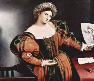
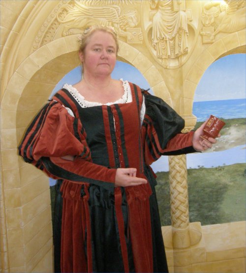
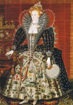
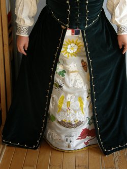
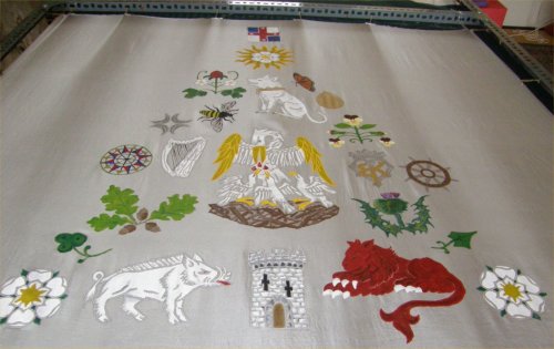

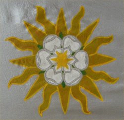


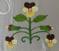
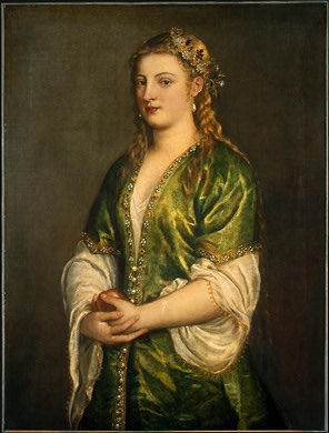
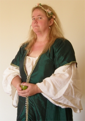
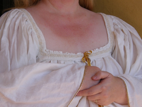
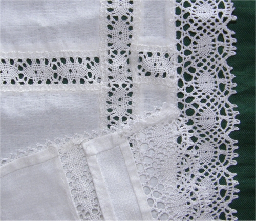


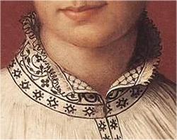
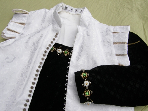
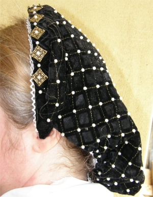

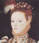


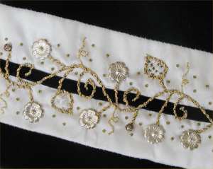
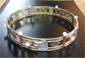
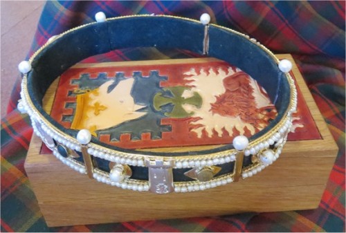

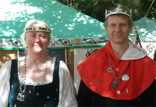


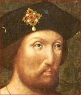
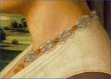

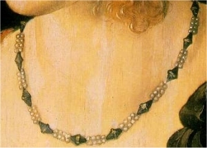

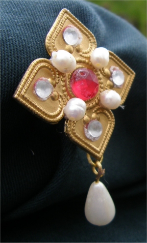
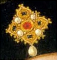
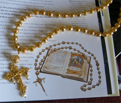
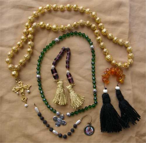
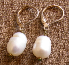
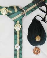
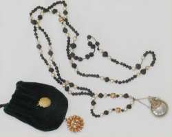

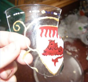
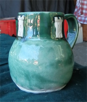

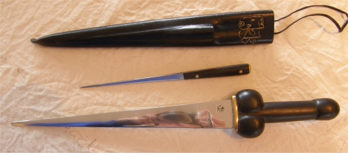

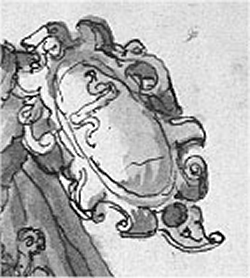

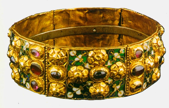
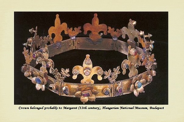
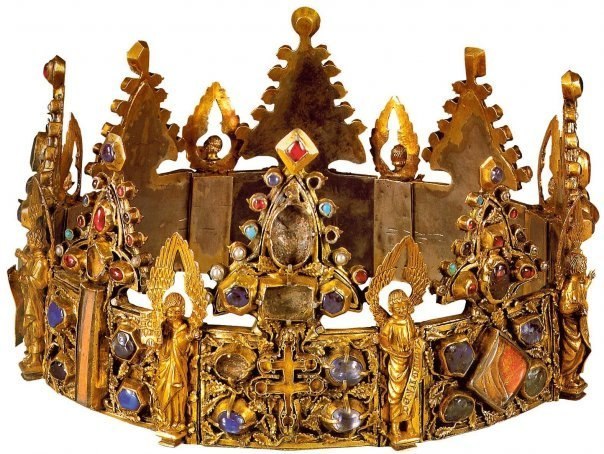