 |
|
November Crown Tourney: PrintingVade MecumCrown and King souvenir programme Flags and Water Bottles Antiphon Crown Broadside
[Crown Tourney-related activities] Southron Gaard hosted its first-ever Crown Tournament in November ASXLIV, and we were determined to make it more than just another tourney. I had seen around five Crown Tourneys by that point and had gathered ideas and plans from those and from extensive research into period practices. I wanted to concentrate on the pageantry aspects, which I think were generally under-cooked, and produce a memorable event that would make people feel that they were witnessing something special. Part of that involved some of the ancillary aspects of the event -- small things that would make it stand out -- and this is what inspired some of the printing plans. Vade Mecum – the Medieval FilofaxMy thanks to Teffania, Padraig and Aneira for sharing information and inspiration. If you needed to carry around a compendium of useful knowledge – tables for calculating moveable feasts or a chart indicating what various colours of urine meant – one handy way to do so was to use the vade mecum (lit “goes with me”). This was a small booklet of folded pages, generally made of parchment, which could be tucked into the belt or hang from it in a slipcase for quick reference. They were particularly popular with physicians or other learned persons, as the format was excellent for storing medical information, such as charts of the Zodiacal Man; calendrical data, such as saints’ days; astronomical information, such as eclipse tables, and the like.
Carey argues that it would be more accurate to refer to these as “folding almanacs”, the term most commonly used by the British Library catalogue (2003, pg 484) for their collection of 10 such works; she prefers the term “folded book”. She considers vade mecum as a “generic term for any small portable notebook or manuscript” such as service books or small format bibles. As a book-binder, I prefer to follow the lead of others in using vade mecum more specifically for the folded notebook format with its original and unusual approach to the binding issue that makes it significantly different to the usual Western-style book per se. Jones notes that vade mecums were typically carried at the belt, fastened by a tassel (pg 52). One marginalia from the Smithfield Decretals depicts Reynard the Fox consulting a vade mecum while his patient, the injured Isengrim, looks on (Jones, pg 48-49; BL Royal MS10 EIV f 54). Reynard has a number of vade mecums tucked into his belt. Some vade mecum were beautiful works of art, with illuminated gold capitals and delicate coloured miniatures (eg BL Sloane MS 2250); others were more utilitarian. The earlier versions from the late 1400s on tended to be manuscript, allowing their owners to add their own information to material that appears to have been professionally penned. Most of them have been written in Latin, although there is one survivor in English and also printed examples. Vade mecums varied in size and page count. Sloane MS 2250, from England in the first half of the 15th century, was 345 x 145 mm when unfolded and contained 16 parchment pages bound at the edges. An Italian example (BL Additional 30034), was considerably smaller, measuring 65 mm x 35 mm when folded – as Carey notes, smaller than a business card – and 125x120 mm when unfolded. Its 15 folios were held together with a small triangular metal plate which had a hole through which a cord apparently passed for fastening to the belt. The largest vade mecum in the British Library collection (Egerton 2572) consists of a long parchment strip measuring 2140 x 180mm, making up 100 panels when folded concertina-style to 120 x 90 mm (Carey, 2003, pg 487). …despite their generally utilitarian form and function, no two examples of the folded almanac are entirely alike; they demonstrate the individual characters, missions and slips typical of well-used objects produced prior to the mechanical age… An analysis of a range of vade mecums (Carey, 2003, pg 486) indicates the following general characteristics: 5-19 folios which, when folded produce a format ranging 120 mm to 170 mm in length with a typical width of 30 mm to 70 mm. The folding systems were just as varied, with single folds, multiple crossing folds, accordion folds – this is what makes it very different to the more conventional form of book binding used in girdle books and other miniature productions. The folios were cut to produce a tab through which the individual pages could be bound, or folded in such a manner to produce two sections with a joining tab. It is this latter approach, demonstrated to me by Lady Teffania, that I have used to produce an event vade mecum for November Crown Tourney ASXXIV, complete with a range of useful information. The front section of the Crown Tourney vade mecum had material from Rene de Anjou's Tournament Book on why tourney, as well as a list of all combatants and consorts, and a call to arms; the rear section was more mundane, with an event timetable, steward's notices and a space for a duty roster sticky label. People did carry them around tucked into their belts, though some found that frequent references to the vade mecum saw it come adrift at the fold. Naturally if we'd been able to do them all in vellum, this wouldn't have been an issue, but it was a big ask of 80gsm photocopy paper....
Vade mecums could be elaborately housed in leather, metal or fabric covers for protection, embellished with braided cords and tassels. An early “girdle book calendar” from northeastern Spain or southwestern France, had a silver holder decorated with six carnelian beads (Boston College). However, plain limp vellum covers appear to be the most typical from of binding, with the outer covers used as title pages. The range of decoration and production standards suggest a fairly broad market for the items and the information they contained. Carey describes one case as comparable to a modern slip-in spectacle case (2003, pg 489), which suggests a new project…. CF AS43 Vade MecumThe vade mecum worked well at Crown, so I produced another one for Canterbury Faire. There have always been problems with ensuring that people have a handy copy of the timetable and remember what chores they have signed up for. The vade mecum format provides plenty of space to have the entire timetable, including all the A&S classes, in one block (I hate it when they are separated out as it makes it very difficult to figure out what is on when and what clashes with what). And we still had room for notes from the Steward, the chore label section, a couple of gratuitous ads and suggestions.
CF43 Vade Mecum (PDF)
I also made a batch of blank vade mecum (vade meci?) to sell at market as part of a cost-recovery exercise. With those, I made two sets, in effect, and then sewed them together at the top with a light cord and attached a small pencil to a long end to provide an extra bit of utility.. November Crown and KingThe Half-Circle Theatre is a period/perioid casual theatre gathering I began at Canterbury Faire. For November Crown Tourney we decided that the first half of the theatre could provide a useful venue for one of the Kingdom A&S Competitions as it was for musical performance. That was open to all-comers. The second half I reserved for a performance of what came to be termed "Of Crown and King".
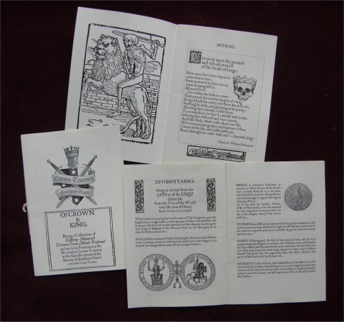
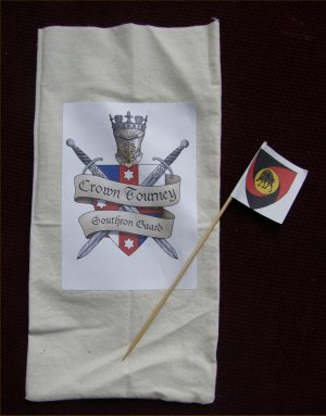
I had collected various small items with a theme of winning the Crown and what it means, its rights and responsibilities, and put these together in a billing, with the support of my lord Bartholomew Baskin, Don William Cameron and Lord Raffe Massard. We had a couple of rehearsals, mostly to work out some rather frenetic staging for Divi Brittanici, the tale of the Kings and Queens of England; that was dropped with some reshuffling of roles when Lord Raffe was unable to attend the event. The bill had a general segue from period, opening with the "Let us sit upon the ground and tell sad stories of the death of kings" speech from Shakespeare's Richard II and progressing through SCAdian tradition with a recitation of the Line of Lochac, penned by Baron Giles Leabrook. Duke Cariadoc of the Bow was gracious enough to permit me to modify his Two Voices piece on the responsibility of being King; Mistress Wander Riordan likewise, let me play around with her song Chivalry, Honour and Love (all links in this paragraph are to the original material). I printed playbills to advertise the showing, and a souvenir programme, collecting the items in their original forms together. The front page announced: Of CROWN A chilly wind and hot-climate Royalty meant that we performed in the Great Hall, rather than at the amphitheatre, which caused some last-minute re-jigging and rigging. The audience were kind enough to forgive us a fluffed line or two, and generally it went well. It was nice afterwards to have someone come up to me and say that they appreciated theatre with a message. Flags and Water BottlesA chance remark from the Event Steward, and a comment about water provision from the Kingdom Chirugeon, saw a late project involving the printing of combatant arms on a number of items. A set of water bottle covers were run up and coloured sticky labels affixed to give each fighter their own for the tournament; a set with the Crown Tourney logo was produced to sell off at market (a lot of the printing activities were undertaken to help defray pageantry expenses).
In the hour or so before I actually left for the site, I was still printing arms, this time as small flags, glued on to bamboo skewers. I hadn't cleared this idea with Their Majesties and was a little concerned that they would think it too close to A Knight's Tale and a tad irreverent for the occasion (though I have come across references to painters in period being paid to make lots of flags for tournaments). I had thought to sell the flags, but was also concerned that this would skew the numbers towards locally known combatants. So I made the same amount for everyone as well as a batch of Kingdom populace flags (around 120 in total).
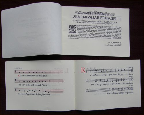
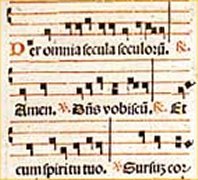
Their Majesties were happy for me to distribute them and I was genuinely surprised at the very pleased response I received. The consorts, naturally, had their own lord's arms as well as a Kingdom flag; members of the populace were generally happy to draw a flag at random. Soon we had people in the stands forming cheering teams for fighters they had never met, and recognising the arms as they took the field and waving their flags. Various tourney officials -- lists and heralds -- chose to wear Lochac colours, and the flags started turning up in hats and headwear. AntiphonThe Printed VersionThe Kingdom A&S Competition included a category for Antiphonaries, subtitled illuminated church music. I slightly subverted the category by producing a late-period printed item, not illuminated per se, but very much definitely an antiphon. Here's the documentation that was presented as a colophon at the back of the final bound versions. We sang the piece at Half-Circle Theatre. I also did a "proper" illuminated version, which you can see here. When Lowrens Wilyamson proposed writing an item for the musical performance section of the Kingdom A&S competition, he suggested that I might like to produce a printed version for the concurrent antiphon category. This is the result. The category said “Antiphonaries including Graduals and Missals - illuminated church music, so probably intended to cover calligraphy items, but if you take that as far as the use of colour in print, perhaps this effort is appropriate. Regardless of that, the research and production of this, let alone being able to sing from a period-style printed manuscript, has been well worth the effort. One of the first printed works to include music was the Mainz Psalter, printed in 1457 by Johann Fust and Peter Schöffer. For such an early work, it was surprisingly sophisticated, including a number of firsts such as colour printing (initial letters in red, purple and blue) using engraved metal plates, and incorporating both the name of the printer and the date of printing.
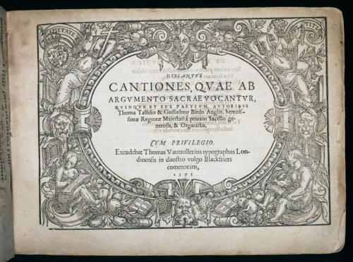
The Psalter’s colophon notes the new process thusly: The present copy of the Psalms, adorned with beauty of capital letters, and sufficiently marked out with rubrics, has been thus fashioned by an ingenious invention of printing and stamping without any driving of the pen. . . . That wasn’t quite true, as the music consisted of two lines of a four-line stave, which had to be added by hand after the rest of the text was printed. Printing music, most particularly getting the necessary accurate registration of notes and staff lines was to prove a headache for at least another 50 years. In England, early printer Wynken de Worde was the first to use moveable type to print music, including a small amount within his 1495 edition of the extensive description work Polychronicon. Three years later, the Venetian Senate awarded Ottaviano Petrucci a “twenty-year patent for the double-impression technique of printing polyphonic music for voices, organ, and lute using moveable type” (Bentley). This was the first such license related to the printing of music per se. In 1501 Petrucci published the first book of sheet music to be printed with moveable type, Harmonice Musices Odhecaton. The Odhecaton, as it is known, included 96 secular polyphonic songs. The pieces, for three or four voices, included the parts printed across a double-spread so that all the singers or musicians could sing from the same page. A more common approach that developed was to print each part separately in part-books. Later printing techniques saw variants such as printing each part at 90 degrees to each other to allow people to stand around the text and sing. An example of this is Ravencroft’s First Booke of Songes or Ayres (1597). Multi-part scores, although thought of as relatively modern, were first credited to the 15C Franco-Flemish composer Josquin des Prez The double-impression technique involved printing the staves first and then running the pages through again to print the notes. Later Petrucci extended his process to a third impression to add lyrics. By the 1520s single-impression printing techniques for the production of music texts had been developed, with individual notes and their associated staff lines being cast separately and then composited to form a whole. This remained the standard approach to music printing for the next 200 years or so. Over the next 50 years, interest in printed music grew and, in 1575, composers William Byrd and Thomas Tallis gained a license from Queen Elizabeth to print part-music and music-paper (Brett, pg 19). The Cantiones Sacrae, produced by Byrd and Tallis in 1575, was their star production, consisting of elaborate canons and other polyphonic masterpieces. The 17 works by each composer were said to mirror the 17th year of Elizabeth’s reign, and the publication was presented to her on her Accession Day, 17 November (Brett, pg 19).
The Cantiones Sacrae was printed by a refugee Hugenot printer, and the more sophisticated Continental style and format is reflected in the production. Its title sheet was the first of its kind to be printed in England in a music work (Brett, pg 20). This printing of the Lochac Praeclarus Est antiphon is based on the 1575 Cantiones, with its engraved title page and comparable layout of title information. Similarly, the layout of the dedication to Their Most Serene Majesties is based on the Byrd and Tallis work, although the general text itself comes from the dedication in Thomas Ravenscroft’s 1621 Whole Booke of Psalmes (itself based on a work by Thomas Sternhold from the 1560s).
Later Cantiones collections include a chant cantus firmus piece (Afflicti pro peccatis) by Byrd, and Brett mentions “a distant nod...to the old votive antiphon” in a number of items included in the 1591 edition. This was actually a rather dangerous thing to do at the time, as it hearkened back to pre-Reformation practices. People winked at it, as his music was so good. Trendell, in examining Byrd’s musical recusancy says: If Infelix ego evokes the votive antiphon, then Aspice Domine de sede from the 1589 collection similarly evokes the world of the pre-Reformation responds of Tallis and Sheppard. Responds were sung after readings at the lengthier offices, Matins and Vespers, and were usually set polyphonically only on the major feast-days. They alternated plainsong and polyphony, and during the full sections the chant would be heard in equal longer notes in one of the voices, usually the tenor; we usually refer to this as an equal-note cantus firmus. (pg 108) In this case, the plainsong sections have been taken from King Rene d’Anjou’s Tournament Book and its instructions on the call to tourney; the polyphony is based on the words of the Lochac Praeclarus Est piece intially penned by Master Crispin Sexi. This mirrors the antiphonal style of the Catholic mass, where one set of voices would sing the verses of a psalm or other part of a religious service and a second set would sing a refrain in response (the antiphon itself).
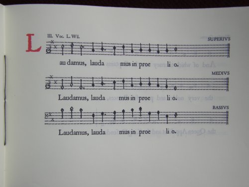
The alternating plainsong and polyphony are printed on the left and right side of the pages respectively, with all three parts of the polyphony grouped on a single page. This differs from the one-page-per-part approach of the Byrd and Tallis production, but was chosen as the music was significantly shorter and this would allow each singer to read from the same page. There is an example in the Cantiones, where one Bass part consists of a primary part and Secunda Pars (pg4).
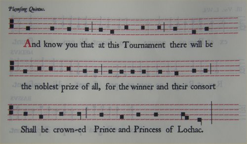
The polyphonic music is printed using Geoffrey Shipbrook’s JSLMusica font, which is based on period musical printing with the note stems extending from the centre of the diamond-shaped noteheads. In a couple of cases where the font has lacked necessary components (most notably in sharps), I have constructed them by incorporating separate appropriate elements.
Lochac Antiphon (PDF, 5MB)
I constructed the entire plainchant layout in a similar fashion, overlaying the necessary neume forms onto blank staff lines using a suitable font approximation (a set of hyphens and square Wingdings!). Although this chant is very simple, there are a number of chant neumes used, including the basic punctus, the, rising podatus, and the descending clivis. Appropriate rhythm indicators are indicated (the vertical lines crossing half the bar).
A Venetian pontifical of music printed in 1520 by Luc Antonio Giunta shows comparable construction to this approximation of a double-impression printing technique, with the four-line staves printed in red, showing gaps between the composited staff slugs, and the notation in a second printing of black. I have not yet been able to find a period depiction of mixed plainchant-polyphon music, but have seen later examples where the different four- and five-line staves with neumes and mensural notation respectively are mixed (eg Novell’s score for the Tallis Magnificat). On a final note, it has been a pleasure singing from this text, making us a little closer to those who sang Byrd and Tallis in the original. Good Newes to Lochac -- Crown Broadside
BackgroundPeople have always been fascinated to hear news of Important People or from Exotic Places. For most of history such information was transmitted orally, but the broader spread of literacy in the later Middle Ages saw the development of letter-writing conveying information from country to town, from country to country.
Eventually this was formalised with the development of copied and circulated manuscripts of letters and reports through to printed pamphlets and broadsides/broadsheets, and on to the early newspapers that formed the foundation of the media print age.
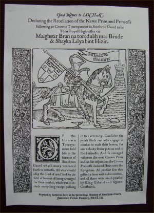
Generally, a broadside consists of a single sheet, printed on one side; a broadsheet is printed on both sides, often on a large piece of paper folded to quarto or octavo to produce an unbound leaflet. Broadsides tend to be commonly associated with the popular ballads that made up a large part of their early production, but they also included handbills, proclamations, advertisements and other information, generally of a topical nature (AMA, Bibliomania; Rickards & Twyman pg 64) According to Rickards and Twyman (pg 64), broadsides ranged from large proclamations (approx 1000 x 500 mm) to small handbills (200 c 150 mm), covering news of formal pronouncements of laws; purveyors of warnings in times of emergency; instruments of protest or personal disputes; acting as a medium of entertainment and irreverence such as public satires; and early examples of commercial advertising. Their simple nature made them more accessible to the illiterate general public, particularly when in ballad format. Supplementation of the “newes” for the more literate (and wealthier) could come from a more extensive broadsheet or pamphlet. The earliest newspapers as such – news printed on a regular schedule for distribution – were the avisi (paid for by a gazetta) of Venice, with weekly news-sheets dating from the 1560s. Not surprisingly, given the city involved, these tended to focus on politics and trade-related matters, with short items filed under a byline and dateline from cities across Europe. The first newspaper to be read in England didn’t arrive until 1620, having been printed in and imported from Amsterdam (Folger). Prior to that, broadsheets provided often-lurid news items, such as the 1591 quarto Newes from Scotland Declaring the damnable life of Doctor Fian a notable sorcerer, who was burned at Edenbrough in Ianuarie last (Sp Coll Ferguson Al-a.36 University of Glasgow). From the mid-1500s on, broadsheets and pamphlets kept people informed of everything from the revolt of the Northern Earls to the births of deformed children (Raymond, pg 15). In 1559, the spread of newes items caused sufficient concern that Queen Elizabeth issued a series of injunctions for supervision of the press: ….and bycause many pampheletes, playes and balletes, be often time printed, wherein regard wold be had, that nothinge therin should be either heretical, sedicious, or unsemely for Christian eares: Her majestie likewise commaundeth that no manner of person, shall enterprise to print any such, except the same be to him lycensed. A Broadside for Crown TourneyVarious print-interested folk throughout the SCA have discussed the possibility of producing a printed broadside at events to report on the “newes of the daie”. While it would have been nice to have a full letterpress set-up, this particular broadside was electronically typeset and output to PDF well in advance – one set per Crown-contending couple to allow for every possible outcome – to enable easy on-site production with minimal printing resources.
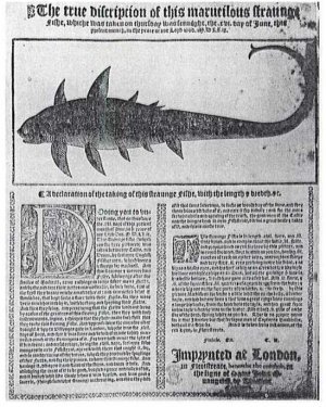
Printers realized that people were so interested…in certain recent events that they often printed single-sheet broadsides to get the news out as quickly as possible. These were usually illustrated and then sold on street corners. The Crown Tourney Broadside is loosely based on the layout of The true discripcion of this marveilous straiinge fishe (1569), having a multi-sentence title header, a large woodcut illustration and a double-column, right-registered format with a large woodcut initial and smaller woodcut sidebars (Watt, Fig 18, pg 166). The text is adapted from the 14th-century Chronicles of Jean Froissart, which contains a number of reports of tourneys and deeds of arms. It is set primarily in a period-style Roman font (JSL Ancient) for readability, with suitable ligatures and special characters. JSL Blackletter is used for just the printing notice. Mixed fonts were not that uncommon in period printing.
The woodcut is an adapted version of the knight from Caxton’s Game of the Chess (1483). The addition of the Prince’s arms (the Lochac Royal Arms with a label denoting the heir) and the Southron Gaard tower were done by hand and scanned into the modified electronic file. The text in the pennant is Princeps Victrix, rough Latin for “the Prince as Victor”. As an aside, a Protestant newsbook from 1590 attacking the papacy included an empty speech bubble in its illustration to allow “buyers to fill in their own unflattering caption” (Folger). Tempting… As far as the hawking of the broadside goes, it was not uncommon for female “mercuries” (often the wives or widows of printers) to trundle up and down the street selling books and other printed items to the public and shops alike (English Broadside Ballad Archive). This apparently made them ideal informants. Hmm…. Get ya newes ‘ere!
| ||||||||||||||||||||||||||||||||||||||||||||||||||||||||||||||||||||||
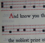
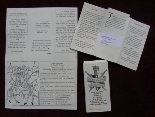 This shows the November Crown Tourney vade mecum in various production stages. At left is the A4 page with the material typeset into the correct orientations for folding. Top right shows the page folded in half and the two side tabs cut away; the white sticky label contained information on attendee duties, with the space left blank for this purpose. Bottom right is the front of the vade mecum fully folded.

 See a
See a 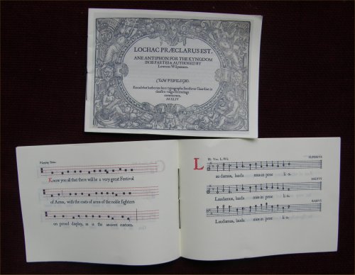
 If you want to take a closer look,