 |
|
Books or Collected Works
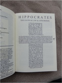
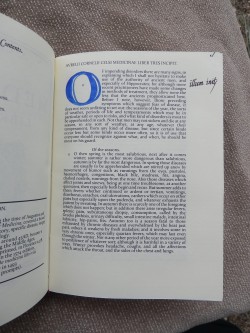
Bespoke Book Project Lady Elizabeth Braythwayte's Book of PhysickWhen we came to bartering with Master Edward Braythwayte for his work on a pair of baronial coronets, one of the things he said he'd like would be a medical book of some form to go with the chirugeons' box he had made for his good Lady Elizabeth. Not a problem! I set to and had a very hard think about how to achieve something that would be appealing as well as educational. And where to start? I figured a collection of all sorts of items, extracts and information would be the way to go about it; an approach I'd already been investigating with the Bespoke Book Project. So I started collecting material -- there are over 100 pages in my notes file covering all sorts of texts, books, websites, image collections, not all of it used, but contributing to what became a decent-sized tome covering a range of medical practices and ideas from the Greeks to the Elizabethans. Lady Elizabeth's Book of Physic ended up being a collation of seven different A5 signatures, each 32 pages in length and each, for the most part, concentrating on a different area of medicine. It starts off with an introductory section, including a dedication based on that William Turner dedicated to the Duke of Somerset in his 1551 Herbal, an extract from Chaucer's Physician, the Rule of St Benedict and a calendar with various medically-inclined saints noted. I had an interesting time fossicking about for printed examples of many of the texts, using them as the basis for doing title pages, titles and text layout. For the most part, the works have been set in Roman type, rather than the more-usual original blackletter. The idea was to give the feel of early printed medical works while still making the material readable to the modern eye. Book II covered General Practice and Surgeries, including some rather sobering advice ranging over the 7th to 14th centuries on what to do if intestines have fallen out (involving a spatch-cocked puppy!), how to amputate limbs and replace them with artificial ones, and how to treat bladder stones. The 12th century Regimen Sanitatis Sanitanum provided lots of advice from the Medical School of Salerno -- much of it pretty sensible and as true today as when originally written. Less popular now, despite its longevity, is the theory of the humours, but no period medical collection would be complete without something on it. I chose to reproduce, almost exactly, Peacham’s printed material from the far end of period, in 1612. I was particularly pleased to be able to take the English text of the Hippocratic Oath and lay it out in the cross shape commonly used in 12th-century manuscripts.
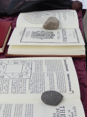
Book III was a reproduction of Book III of the eight-volume De Medicina by Aulus Cornelius Celsus, a Roman medical authority now possibly more remembered for a critic who came after him -- Paracelsus. De Medicina was the first medical text to be printed, with that edition appearing in Florence in 1478 having remained a standard work for hundreds of years. The title page layout I used was based on the 1574 edition, with the text following the 1493 work, including indicating the printer’s prompts for where the illuminated capitals should go. The illuminator for the version I looked at had only done some of the work, so I followed suit, hand-painting the initial capital only. Book IV was a herbal, consisting of a heavily edited selection of material from Cockayne’s Leechdoms, wortcunning, and starcraft of early England. Published in 1860, this work aimed to collect a pile of older material together, providing a look at the Anglo-Saxon approach to medical herbcraft covering a wide range of conditions. There are also entries on mandrakes, aconite, roses and tobacco, as well as Nicholas Culpeper commenting on John Gerard. Book V covered astrological medicine drawing primarily from sources, treatises and other material printed in the 1500s. I included a couple of astrological charts to demonstrate the old square format, and had fun reproducing a zodiac. Paracelsus (aka Theophrastus Bombastus von Hohenheim) provided a good source for the magical side of astrological medicine, with his instructions on how to create amulets, sigils and seals. Bhana Bhioncas Caristiona nic Beathain was of signal help in providing advice and inspiration for this particular signature.
Book VI was on the Plague, ranging from Boccacio’s description of what drove his company away from Florence to tell the stories of The Decameron, to Plague Orders issued by Elizabeth and James I, set to match the various desperate instructions printed in the latter 1500s as the plague ravaged England time and time again. The item which really appealed here was the Bill of Mortality for London – the one I reproduced was printed in 1665, but they date back in various forms to the time of Henry VIII. Aside:I took my copy of the Book of Physic to Festival and it was quite handy in an impromptu class on period medicine. Mistress Filippa Ginevra went through the various causes of death in the Bill and explained the more obscure ones – death by being Killed by a fall from the Belfrey in Allhallows the Great is fairly obvious, but how do you die from Stopping of the Stomach or Rising of the Lights; and what’s Imposthume?? The final book, Book VII, was a reprint of my work on the Crescent Isles Herbal, a treatise on local perfumed plants which I’d undertaken some years back for a Kingdom A&S competition. Master Edward had asked for a girdle book, and THL Isabell Winter kindly took on the task of binding the work in that format. She also very kindly bound a copy for me, with blind stamping on the cover and no facing end-papers, in lovely period style. At 200 pages, the signatures are around a centimetre thick in total; add the wooden boards of the bound covers and it really does feel like a period work. I’d supplied her with the signatures I’d used as a proofing copy; proofing marks have changed very little between those used by period printers and the ones I learned sitting at a newspaper subbies-desk. It was good recycling and a chance to show people how this sort of thing is processed through the stages of printing. If you want to track down the materials I referenced in the works, take a look at the medical section on the Bespoke Book Project page, where most of the references appear. A Crescent Isles HerbalI did this herbal as an entry for the Midwinter Coronation Kingdom A&S Competition, which asked for A Treatise on the Properties of a Perfumed Plant (in the style of Culpepper). The lovely Luke from the AS50 list had this to say: "Well I have to say your herbal has left me in awe. I am in the mundane world a botanical librarian and your effort with it is excellent, positively first rate. I cannot begin to commend you for it." What a sweetie! IntroductionHerbal lore has a long and varied tradition, but the real flowering of the treatises known as "herbals" did not really get underway until the 1500s, fertilised by the development of the printing press. In terms of British printed herbals, the first one of note was Banckes Herbal, an unillustrated tome published in 1525. The following year saw the production of Peter Treveris's Grete Herball, which was largely based on a French work, though written in English, and illustrated with almost 500 small woodcuts of plants drawn in outline.
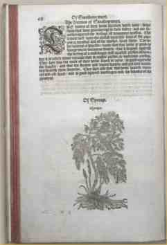
The British botany scene finally got a solid locally-based herbal from William Turner, whose 1538 publication Libellus de re Herbaria Novus was the first to take a scientific approach to the subject. From 1551 to 1568, he published three volumes of A New Herball, notable for having significant coverage of native plants. Not all of his work was original, however, with the illustrations largely repeats of woodcuts from a 1542 work by famous German botanist Leonhart Fuchs. John Gerard, of the still-consulted Herball of 1597, was the last of the great English herbalists to be published within the SCA period and he too, cribbed a lot of his material from earlier works including a translation of Dodoens' Latin herbal, published in 1583. Of the 1,800 woodcuts in Gerard's Herball, only 16 are said to be original to his work. Nicholas Culpepper (sometimes Culpeper) followed on in this tradition. His best known work, the Complete Herbal, falls well outside our period of interest, having been published in 1653. Like earlier herbalists, Culpepper had a strong interest in the medicinal properties and usages of common plants, but he supplemented this with forays into the long-standing philosophy of the humours and astrological beliefs to a far greater degree than earlier proto-botanists. That said, like many herbals, a good deal of his content is based on earlier works, both of the Ancients and the then-Moderns. I have chosen to base my treatise's content on Culpepper's mix of botanical, medical and metaphysical material in order to meet the requirements of this category that it be in his style. On any case, much of his material references earlier work, particularly the concept of the humours espoused by the Greek physicians Hippocrates and Galen, and the astrological lore typified by the likes of German mystic Cornelius Agrippa in the earlier part of the 1500s. I have, however, decided to base the physical presentation of my treatise on that of William Turner's Herball of 1568. The approach of this work is reasonably comparable to that of Culpepper, as it too consists of entries for individual plants accompanied by woodcuts of varying quality. Its major distinction is in that it is a pre-1600 printed text - to the practised eye, Culpepper's printed works are clearly of the mid-17th century. (See the accompanying materials for examples of both which illustrate this.)
The Herbal (PDF, 2MB)
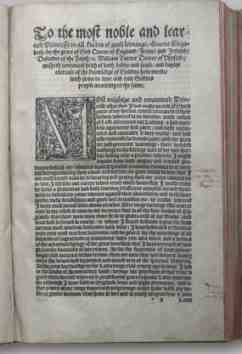
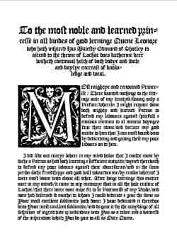
Treatise ContentThe content, for the most part, follows Culpepper, although the preface at the start of my treatise has been adapted directly from Turner's own preface in his 1568 Herball; it's an appropriate choice for a Coronation entry given its panegryics to the Crown. My preface is considerably shorter, however, in line with the smaller nature of the treatise. To the most noble and learned princesse in all kindes of good lerninge Quene Leonore who hath inspired His Majesty Edmund of Shotley to ascend to the throne of Lochac does katherine kerr wisheth continual helth of both bodye and soule and daylye encrease of knowledge and weal.
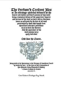
The lengthy title is based on Culpepper's English Physitian and the Joyfull Newes Out of the Newe Founde Worlde, published by Frampton in 1577. The Perfum'd Crescent Isles/ or/ An astrologo-phisickal discourse on the diverse and sundrie perfum'd plantes of this land/ being a compleat survey of the properties/ degrees and vertues of the same as were used in Anciaunt times as orfeyned for the hele of all most partickularly those who would scent themselves and their possessions so as to smell the sweeter; Also the portrature of the saied plantes very aptly discribed.
The acknowledgements at the front follow Turner's, but include the period authors I checked for this work. Most herbals focused on the medicinal qualities of plants, real or imaginary. A plant entry would contain information on the name and locale, the therapeutic use and planetary influences, popular lore and alleged properties. Verbal descriptions were supplemented by illustrations, but the reliance on older works and translations of translations meant that the content contained, as Douglas Adams remarked of another work, "much that is apocryphal, or at least wildly inaccurate". Wright characterises them as "little more than compilations of folklore, traditional commentary on plants, and folk medicine" (Wright, pg 575). Culpepper's entries tend to follow a standard pattern of name and derivation thereof; physical description; place and time of growth and flowering/fruiting; and astrologically based government and virtues such as medical uses. He has very little to say on the nature of perfumed plants. Even the most obvious perfumed plants such as lavender or violets have that property mentioned only in passing as part of the description, with the bulk of Culpepper's commentary focusing on the medicinal applications, eg: Violet Description. The root is perennial: it is long, slender, crooked, and fibrous, and the leaves are numerous; they are supported on long slender leaf-stalks, and are of a roundish figure, heart-shaped at the base, slightly notched at the edges, and of a dark green colour, several slender creeping stems or wires rise from among them, which take root at the joints, and so propagate the plant. The flowers are supported singly on long, slender, fruit-stalks, which rise immediately from the root; they are large, of a beautiful deep blue or purple colour, and extremely fragrant. The seeds are numerous, they are egg-shaped, and furnished with appendages. The Plants and their LoreInstead of the more obvious perfumed plants to be found in Europe, I have decided to indulge my taste for anachronism and have based my treatise on perfumed plants found in my own country of New Zealand, covering them in the same manner as Culpepper and presenting them as Turner would have. A traditional lullaby tells us of the native plants used by Maori for their perfumed properties: Taku hei piripiri
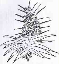
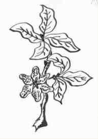
Piripiri: Lophocolea allodonta et al Various aspect of these plants were used by both Maori and early European settlers. Colonial botanist Joseph Hooker described the Lophocolea mosses as having a "pleasant, powerful, and lasting" scent, variously noted as sweet, often fragrant and aromatic (RSNZ). Some ferns were known to be perfumed, with the small mokimoki being highly regarded, and recommended for its scent by gardening outlets to this day. The tawhiri tree, Pittosporum tenuifolium, provided a sought-after aromatic gum. The choicest and rarest scented gum was obtained from the taramea (Aciphylla colensoi), a very spiky alpine speargrass. The gum of this plant was only collected through much labour, toil, and difficulty, accompanied, too, with certain ceremonial (taboo) observances. An old tohunga (skilled man, and priest) once informed me that the taramea gum could only be got by very young women-virgins; and by them only after certain prayers, charms, &c., duly said by the tohunga. The Maori lullaby uses the term kati taramea, referring to the sting, bite or puncture of the sharp leaves, a characteristic reflected in the European name Aciphylla (or needle-pointed leaf). Many of the period herbals considered the etymology of the names of plants, and tied these into their properties, and I have done so too throughout the treatise where possible. Also in line with period practice, I have assigned aspect of the humours and attributions of various elements, qualities and temperament associated with those with each of the plants, based on their physical characteristics and typical location. Thusly: Piripiri has the humour blood, the Element of Air, hot, moist Quality, a sanguine Tempermanet and is governed by the Moon Piripiri is a variety of liverwort, a type of mossy plant traditionally associated with blood. It was used by Maori as a scented lining for babies' napkins and possibly used by women during menstruation. The tawhiri is sometimes called the black matipo, because of the sticky black seeds and its dark bark. This clearly gives it a relationship with the humour of black choler. According to Crowe, it has three distinct fragrances, from the crushed leaf, the flowers at night and the gum (pg 49). The latter was sought after by the Maori for scenting hair oil and making a form of flavoured chewing gum in conjunction with puha resin. As a fern, mokimoki is found in damp environments such as on the river margins of coastal forests, so is naturally associated with water. Its fronds are sweetly scented - like marzipan -- when crushed, and were commonly used by Maori as floor coverings, in the same way Europeans used rushes. Given the nasty descriptions of the taramea speargrass, it seemed more than appropriate to associate it with a choleric humour. I have played with the fact that an alternate name is Spaniard. The various factual aspects of the plants regarding plant description, growth patterns and uses noted in the treatise text are based, for the most part, on anthropological or botanical sources, such as Crowe, Webb, Parkinson, the RSNZ and others. Other aspects are taken from similar plants cited by Culpepper. In the virtues, I have put a paragraph break between the ones based on actual botany of the plants from the Crescent Isles and the claims made by Culpepper for similar plants found in Europe. The "philosophic" names refers to the actual scientific names given to the plants. Given the A&S category requires a focus on perfumed plants in particular, I have ensured that my text includes information on that aspect, although relatively little was available for the plants I chose. Here is the text:
IllustrationsPrinted herbals, whether in England or on the Continent, quickly took to illustrations, first woodcuts , later the more detailed works available through metal engraving. Copying, swapping and even repeating the same plates under different plant names were all common practices for the next 300 years (Glasgow).
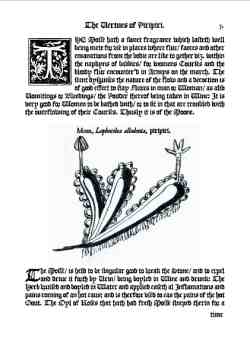
Early printed herbals, first appearing from the 1480s on, are notorious in printing circles for the amount of distortion and errors that crept in as woodcuts were used and reused, worn down, miscopied and mislabelled. The 1526 Grete Herball was described as "providing a remarkably sad example of what happens to visual information as it passed from copyist to copyist" (Eisenstein, pg 82). The difference between what contemporary painters were capable of and what woodcut engravers produced for herbals was considered "shocking" (Eisenstein, pg 219). This was attributed, in part, to the illustrators looking to illustrate the text descriptions rather than actually work from nature itself. I have attempted to replicate the rather sketchy nature of the early woodcuts, following Fuchs' justification for his simple approach: We have purposely and deliberately avoided the hiding of the natural forms of the plants by shadows and unnecessary things by which artists sometimes wish to win praise. By the sixteenth century, attitudes towards such illustrations had changed, and they became more than simply a text accompaniment. Authors, in despair at the inadequacies of purely verbal description, sought the aid of skilled draughtsmen and artists, trained to observe carefully and well. One of these authors was William Turner, whose A New Herball is said to have been a "great advance" over others for the more accurate focus he paid to scientific observation of plants (Wright, pg 575). While my artistic skills are fairly limited, I have attempted to draw the plants from "life" (ie photographs) in line with Turner's approach. The scanned efforts have produced faint shading behind the drawings fortuitously akin to the block print that can be seen in some of the woodcuts. FormatWhile the initial herbals tended to be large folio editions, it wasn't long before canny publishers cottoned onto the idea that more convenient pocket editions would be popular for those who wanted to take their herbals into the field (Glasgow). The man of wealth might procure a folio illustrated in colours, but always available were less pretentious books to fit the purse of the small tradesman and artisan. Banckes' quarto Herbal was often referred to as the "Little Herbal", to distinguish it from the Grete Herball, and its small size and relative cheapness made it a popular household reference. As interest in botanical studies grew, so did the size and complexity of herbals. By the time John Gerard printed his Herball Or Generall Historie of Plantes in 1597, herbals were running at around 1,500 pages of folio text and illustrations, coloured plates began to be used, and although the costs had risen significantly, there was sufficient demand for editions to sell out completely. I have chosen to present my treatise as a small quarto (ie a sheet folded in half to produce four pages). A full facsimile of Turner's Herball is available online at the Rare Book Room. I have pored over the pages to develop a general style guide for this treatise. The layout is single-column black letter, right justified. I've used JSL Blackletter, Geoffrey Shipbrook's excellent near-period blackletter font, which is a reasonably close match to that used in Turner. Large drop cap woodcut-based initials contain flourishes and figures, and run from 3 to 12 lines in depth, depending on placement. The ones I use are comparable to those in Turner, as are the less historiated small drop caps. The pages have running headers that are centred, and opposing page numbers at the top. The illustrations are unframed. Turner's run as a mix of single and double column with the occasional block insert within the text; mine are all single column. A Roman typeface is used for the captions; I have used JSL Ancient as a matching Roman font. Turner has used a mix of common names and more formal names (eg Aconite, Aconitum lycostonum, Wolfsbane), and I have followed this pattern in the captions. I have omitted the Table of Contents which Turner has - my treatise is significantly smaller than his and has no need of one. Turner's work finishes with a small FINIS announcement, rather than the more elaborate colophon one might expect (perhaps that is in the third volume which I have not seen). The paper is 90gsm Conqueror bond laid which is a readily available close approximation to paper used to pre-1600 printed works (I've looked at books from the 1500s in the St Brides Printing Library and was surprised to find just how close a match it was). As a small treatise, this work has not been hardbound, but simply stitched together with a pamphlet stitch using linen thread, itself a period binding practice. Comments Ball HandbookFor Canterbury Faire 42 I was asked by Mistress Katherina Weyssin if I would do a ball handbook in a late-period printed style, with instructions and maps and suhlike. How could I refuse? The 12-page handbook was graced with a picture of Caroso on the cover. In honour of the theme of the an Age of Explorers and Sea-Farers. I used the Windlass font in addition to the usual JSL ones, as it has a distinctly bucanneer/piratical feel to it. I did like the inclusion of the Three Rules of of Dance Etiquette: 1. It is unseemly to always dance with the same person, therfore be courteous enough to invite strangers, travellers, those shy of nature or less sure of the steps to dance. It's always nice to try and encourage better mixing, even if it is usually in vain!
The four sets covered dances from England, France, Dances of Antiquity and dances from Italy, with the traditional Tassel Kick competition providing a break. Each section included the steps of the dance, an indication of its difficulty and a suitable woodcut or map from the relevant region. Perhaps not surprisingly, the Italian section was very long indeed, despite having far fewer dances than the English.... PlaybillsI have printed playbills for the Half-Circle Theatre at Canterbury Faire, and for Master Steffan Glaube's Mandragola play at Rownay Festival. Here are the PDFs, sized for three to an A4 sheet to get the right kind of proportions.
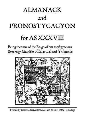
Half-Circle Theatre (PDF A4) Almanac and Prognostycacyon AS38I wanted to produce something that could act as a souvenir for Canterbury Faire and be interesting at the same time. Long years as an astronomy writer, and as a sometime astrological chartmaker, suggested a possible tack, and thus the Almanac was born. The research was a great deal of fun, in deciding what manner of predictions to include, how to modify the horoscope casting for period use and so forth. The most awkward thing was that I didn't have any extensive period facsimiles to work from, just the odd page referenced here and there. I'll have to see what I can find for any future edition to produce something more closely resembling what was printed in the late 1500s. Here's the documentation for the current edition:
Telling the time and predicting the future have always been important aspects of civilisation. Roger Bacon (Opus Majus, 1267) was the first to use the Arabic-derived term Almanac to describe his set of tables of the apparent motions of the heavenly bodies. Early almanacs also used the term prognostications, supplementing astronomical and calendrical information with discussions of the influence of the heavenly bodies on earthly topics such as weather, health, romance, and national and international relations. This 16th-century almanac starts with the Common Notes, being a list of obscure terms and data used typically to calculate moveable feasts, such as Easter. The dominical letter of the Gregorian calendar year is the letter label of the Sundays in the year; leap years receive two dominical letters. The golden number is a 19-year cycle related to the Metonic lunar cycle, and called such because it was written in gold in early church calendars. It is used in computing the epact, which relates the lunar and solar calendar. The Constantine indication is a 15-year cycle introduced by Constantine for tax reasons which, according to Madore, is "part of the computus but of no interest whatsoever except to decorate calendars". And The Answer is, of course, the Answer to Life, the Universe and Everything - there's got to be an anachronism in everything to avoid perfection and the potential for hubris, after all. Almanacs traditionally had a section for the "Zodiac Man", which depicted the parts of the body which corresponded to astrological influences, providing medical and romantic advice (Lawrence, 1898). The text used in this section has been adapted from an almanac in use in 1571, with some material from William Lilly's Christian Astrology (1647) and William Ramesey's Astrologia Restaurata (1653). Cerniglia notes that: This sort of information has, of course, been included in this version, with prognostications covering the weather, general predictions and astrological aspects. The weather predictions are based on the NZ MetService summary for early February in Canterbury, with a suitably uninformative approach comparable to many found in almanacs throughout the 1500-1800s (or in modern forecasts for that matter!). The general predictions are based on the 1591 satirical almanac A Wonderfull Astrologicall Prognostication, in ridicule of the almanac-makers, allegedly penned by Adam Fouleweather, and commonly attributed to Thomas Nashe. Also included are a couple from Rabelais's Pantagruelian Prognostications (Chapter 25 of the Third Book of Pantagruel; 1532) and a line from Merlinus Anonymous.
The astrological aspects come from an event horoscope drawn up for the time of Canterbury Faire's opening court, using the interpretations provided by the Astrolabe astrological service, as well as relevant material from Lilly and Ramesey relating to the planets, signs and placements. Almanacs also listed information about saints, often deliberately including fake ones and some decidedly unsaintly listings or datings. This almanac's saints (all real) were selected from the list maintained by the Catholic Forum; the datings (not all real) were developed based on those contained within period almanacs. I wrote the closing poem based on the famous opening lines from Chaucer's Canterbury Tales. Almanacs were extremely popular works, and consequently were early to print; the first printed almanac known was by Purbach (compiled 1450-1461); the first English almanac is dated 1500, printed by William Parron, who was attached to Henry VII's court. The general approach is known to have stayed static for almost 200 years, so I have assumed it reasonable to use some post-period examples in deciding on the text and layout. Almanacs were often produced as small booklets for ease of carrying and reference. The typeface used is JSL Ancient, developed by Jeff Lee based on the transitional typefaces used by English printers Edward Jones and J. Redmayne in the late 1600s; the text has been run through Lees' JSL Font Converter to produce ligatures. The cover image is adapted from the Prognostication printed in Lyon for Michel Nostradamus in 1555. Almanac TextHere is the text ot the almanac. ALMANACK and PRONOSTYCACYON for Anno Societatis XXXVIII Comprehending the dayes of Canterbury Faire Common Notes for AS XXXVIII
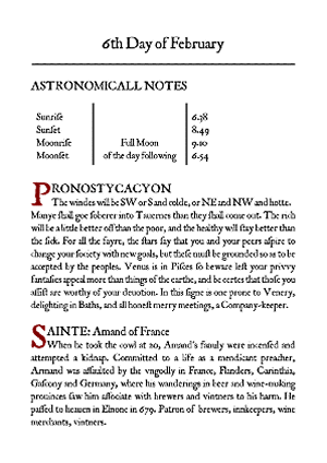
The Anatomy of Man's Body as govern'd by the Twelve ConstellationsNo part of man's body ought to be touched with the Chirurgicall instruments, or cauterie actuall or potencial, when the Sunne or Moone, or the Lord of the Ascendent, is in the same signe that ruleth that part of man's body. At this time look for the Kings Evil, sore Throats, Wens, Fluxes of Rheumes falling into the Throat, Quinzies. And with the Moone in Cancer, check for Whelks, Pimples in the Face, small Pocks, hare Lips, Polypus, (noli me tangere) Ring-worms, Falling-sicknesse, Apoplexies, Megrims, Tooth-ach, Head-ach and Baldnesse. If the same be for the Pestilence, the Phrensie, the Pluresie, the Squincie, or for a Continuall headach, proceeding of choler or bloud; or for any burning Ague, or extreme paine of partes, a man may not so carefully stay for a chosen day by the Almanack: for that in the meane tyme the pacient perhaps may dye. For which cause let the skilfull Chirurgeon open a veine, unless he finde the pacient verie weake, or that the Moone be in the Same Syne that governeth that part of man's body. Seekest thou a Chirugeon for your ills, a water-bearer for your thirst. 5th Day of FebruaryASTRONOMICALL NOTES
PRONOSTYCACYON SAINTE: Agatha 6th Day of FebruaryASTRONOMICALL NOTES
PRONOSTYCACYON SAINTE: Amand of France 7th Day of FebruaryASTRONOMICALL NOTES
PRONOSTYCACYON SAINTE: Thomas Sherwood 8th Day of FebruaryASTRONOMICALL NOTES
PRONOSTYCACYON SAINTE: Ciwg The Canterbury PilgrimsAnd on the final page, a hopeful plea...
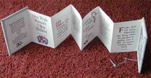
When in February the hot dayes do falle Predicting how all may goe is no easy task Almanac PDFHaving finally sussed how to save PDFs out of Ventura, here is the full typeset version of the almanc as a PDF. It's laid out to be printed octavo on A4, double-sided. Concertina Quote BookFollowing on from the production of the bookmarks, I looked to see what other applications I could make of the quotes I had found inspirational. When casting about for a gift idea for Queen Yolande's visit to Canterbury Faire, I came up with the idea of putting the best together in a small booklet. I had seen concertina books in modern books on art binding. I have also seen mention of concertina folding for vade mecums, and know of various other foldings used in printed materials, but the approach I used for this quote book has no specific documentation from period (shock, horror, gasp -- maybe one day).
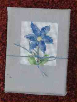
I set a batch of quotes of relevance to the Crown in a variety of period style fonts, with some (electronic) rubrication and accompanying woodcuts or other artwork. The setup had two sets of four panels in landscape orientation per side of an A4 sheet. These were cut and pasted together in a line, resulting in 14 quote panels with the leading front and rear panels used as paste-downs to a pasteboard cover. The latter was covered in a leather skin with an inset of an cross-stitched borage worked on by my daughter Grace (then 10). A light cord with silver beads formed a tie closure.
Here are some of my favourite quotes, gleaned from a range of sources:
Concertina Quote Booklet (PDF, 400KB)
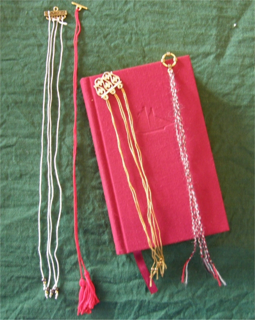
Update: I have since made similar quote books for our retiring Court Chamberlain, Condessa Catalina Orosol, and for Their Majesties of Caid when They visited Canterbury Faire in ASXLVI. For the latter version, the covers were in blue with a pewter Caidan Cross (originally a gift from King Edric many years ago) attached, closed with a blue-and-white braid done by my daughter Grace. The final panel, instead of the usual Death and the Knight Durer woodcut, had my version of the Columbus discovery woodcut, showing Caid, the Southern Reaches/Crescent Isles and Lochac. BookmarksOK, so bookmarks aren't really a printing thing, but they are associated with book production, so here they are. I've been experimenting with producing stand-alone bookmarks for a while. Initially these have simply been printed words of wisdom on stiff card, with woodcut illustrations. I haven't seen any indication that these have a period counterpart, as most histories of bookmarks start talking about independent paper-based ones as coming in from the 18th century onwards. That said, there have been examples of vellum strips and the like found in books which may well have been functioning as casual placeholders. I've done bookmarks of this type covering a range of topics, such as period bon mots, relating to the Crown and suitable as a gift for a wedding guest. Typeset Paper Bookmark Single-Sheet Sonnet Historic BackgroundBookmarks of some form or other are likely to have been around since book began. I do like the expostulation of the 14th century book-lover Richard of Bury, in his Philobiblion (1344), when he castigated some unthinking student who: ...when he tires of studying carelessly folds the page so as to remember where he stopped. Or it occurs to him to mark with his dirty nail a passage that amused him. Or he fills the book with straws as reminders of the interesting chapters. These straws, which the book cannot digest and which no one bothers to remove, break the joints of the book or end up rotting away inside the volume Richard was right about these practices -- the remains of straw, stems, string and other items have been found within the pages of medieval manuscripts, as have scraps of parchment and vellum used as markers. Roberts tells a rather sweet story of a 13th-century manuscript where three bookmarks of scrap vellum are noted by the current library as to be kept between the pages where they were originally placed, adding: It is interesting to note that after nearly 800 years these bookmarks, which started life as nondescript scraps employed to do a temporary service, have become an integral part of the book in which they were placed so long ago, and that now the manuscript would somehow be a different document without them in their “proper places". The earliest bookmarks appear to have been the register bookmark, made of cords of vellum, leather or string attached to the headband, knotted at the other end which projected past the text block. Some of them were simply looped through a tab or hole near the top of the spine (Roberts). Other materials, as noted above, were used; there are manuscript illuminations which show one of the bookstraps inserted within a book rather than holding it closed, presumably to mark a place.
Another variant Roberts mentions included a parchment disk attached to the cord halfway down. This had a rotatable column number indicator on it (I,II, III,IIII) as a further aide memoire for texts that had multi-column layout. There are 12th-century versions of these surviving in manuscripts held in Cambridge University and Hereford Cathedral libraries. Book publishers even produced built-in tabs in medieval times, with strips of vellum or linen thread being attached to the fore-edge of pages to mark certain sections. Some of these were fairly crudely done, but a 15th-century psalter has vellum tabs which have been decorated with coloured beads (Roberts). As you may expect, the earlier the bookmark, the simpler. Szirmai (pg 123) notes how long triangular vellum strips could be rolled to form an anchor to which vellum thongs could be attached for an independent bookmark. Roberts' article shows one from Exeter Cathedral, which has five such markers. Another has linen strings (three white and two red, white and blue braided strings) attached to a wooden anchor. Some bookmarks were attached not to the book itself, but to the chemise leather or silk cover (Farley); this was apparently a popular approach for Books of Hours, which were often covered in this fashion. In other cases, the bookmark is an independent set of cords, ribbons or other markers held in place by the button or bead sitting across the top of the text block. Medieval Clothing and Textiles Vol 3 covers a variety of bookmarks from the 12th to 16th centuries (pg 145-179). These involved rolled parchment "anchors" or round or flat bars otherwise made out of beads or bone, metal or wood; these are sometimes called pippes. Some of these were precious metal or inlaid with such, sometimes enamelled. To these would be attached fine cords, threads, strips of leather or ribbons, typically in even numbers ranging from a single pair attached to the anchor, to as many as 14. The ends of the cords would be finished with knots, beads, pearls or tiny tassels. These types of bookmarks are depicted in paintings throughout the period, such as: And here are some examples of the ones I have made. They're different sizes as they have been produced to match books in my library, particularly those ones which have multiple passages I want to mark (such as Machiavelli's Prince).
There are some later references (such as here) to Queen Elizabeth having been presented with a fringed silk bookmark in 1584. The gift came from the Queen's Printer, Christopher Barker -- Elizabeth had awarded him a patent in 1577 which licensed him to sole rights to print the Bible, so there was reason for him to be suitably grateful. Apparently Barker was also a draper, which is where the silk came in. I haven't found any further descriptions of this, but shall be keeping an eye out. One of the things which most intrigued me was a comment on the use of these bookmarks. Having multiple marks seems odd to a modern reader used to starting a book, reading through it and finishing it - we typically need just the one bookmark to mark literally where we are up to. Period texts, however, weren't necessarily read in this fashion - it was much more likely to skip around in a book, making the reader want to mark various passages in different places. That's particularly so in the case of philosophical or religious texts -- even today missals often come with multiple built-in bookmarks so that the priest may mark the various discontinuous passages necessary for conducting the appropriate service. The Tales of Canterbury FaireThe intent of this project was to produce a work which approximated the type and nature of a mid-16th century English publication, to showcase the excellent material resulting from the Bardic Auction at Canterbury Faire in ASXXXVIII. The text was typeset electronically, primarily using the The title-page follows standard conventions of the time, being a mix of fonts and explanations, along with publisher information including the timing and place of printing. Title pages were relatively late to develop, not being fully established until the 16th century according to Steinberg (pg 68). Their layout is very characteristic, and a number of excellent late-period examples are accessible via the Shakespeare's Sonnets Website.
A dedication was a common feature, though many period ones run to multiple pages of very flowery flattery (see A new Booke of Tabliture, by William Barley, 1596, used as the basis for the Tales' dedication). The text ends with a colophon; this tail-piece was typically used as the means "by which the printer-publisher proclaimed his part in the proceedings" (Steinberg, pg 60) and I've also used it to acknowledge source material. It was typically set with text centered as it flowed down the page or to produce a shape, such as a goblet or hourglass.
The illustrations come from a wide variety of sources, most notably the Boke of Good Cookery clipart archive of period woodcuts. I developed others electronically, most notably the large capitals where suitably relevant illustrations and typeface have been combined following a very helpful suggestion from Master Crispin Sexi.
The main criteria for illustration selection was their appropriateness for the period and nature of the printing - almost all are woodcuts or engravings from the 15-16th centuries - as well as their relationship with the subject matter.
Clement, Richard W.; Medieval and Renaissance Book Production - Printed Books The general layout of the work, in terms of pagination, running heads, use of illustrations and capitals, design format etc was developed after many, many hours poring over large numbers of period examples in texts, online and in museums. In particular, a visit to the Gutenberg Museum of Printing in Mainz provided access to a huge range of period printed samples, though the lack of any substantial captioning in English was a tad frustrating.
The paper used is laid, cotton-based, 100gsm cream Conqueror, folded to produce a quarto (roughly A6). It is a reasonable approximation of the type of paper in common use for printing in later period, described by Middleton as of linen or cotton rag content with a yellowish tint and well sized (pg 3). This book is some two centuries away from the first recorded use of paper, which was in 130,8 for the Register of the Hustongs Court of Lyme Regis.
The basic binding techniques used are period ones, for the most part using period-style equipment, including a book press, bone folder, basic sewing frame techniques, linen thread, beeswax, bodkin and hammer. A list in Middleton (pg 245) gives the equipment inventory for the 16th-century bindery of Nicholas Pilgri, stationer and binder of Cambridge (d 1545), which included:
I chose to use Plastipad for gluing, a glue used by modern bookbinders. I did not want to experiment with period wheat-paste starch in the limited timeframe available, particularly because these were intended for gift or sale. That's a project for another day. Codex binding has not changed a great deal in its basic approach over the centuries and books by modern craft binders such as Shareen LaPlantz and Arthur Johnson provided a useful adjunct to more academic works.
Almost 50 copies were made of the soft-cover Tales, with almost half designated as gifts for participants and supporters of the Bardic Auction. In 16th-century England, small books were often sold in blue or brown paper wrappers, or often no covers at all, and stab-stitched through the side with three or five holes. These books were neither trimmed along the edges nor lettered on the outside. (Middleton, pg 11).
The soft-cover Tales follows a similar approach in a two-signature, pamphlet-stitched format, sewn directly through a fold in the cover. It has been bound in burgundy book leatherette, used because a large quantity was freely available (an important consideration when producing 50 copies!). This approximates the right look, colour and style of the cheaper printed works of the mid- to late 1500s.
Alison Plowden, writing in Elizabethan England, Life in an Age of Adventure (Readers' Digest 1982), noted: "At the cheaper, and more remunerative, end of the trade, books and pamphlets sold for sixpence or a shilling (the equivalent of modern paperbacks) were illustrated ith woodcuts and either just sewn together or roughly bound in a limp vellum cover." She also noted that the maximum number of copies for any one edition as laid down by the Stationers' Company was 1,250. If more were needed, you had to reset all the type! Presumably this was intended to ensure even distribution of work amongst the printers, but I suspect that few print runs made it to this level in any case.
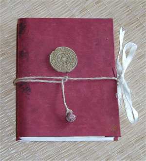
My soft-cover has a jute string band fore-edge closure with a scallop shell token. Wrapping bands with ornaments were a common feature of books, (I chose jute over leather strapping purely for economic reasons). Wrapping bands are typically wound round the book over the fore-edge two or three times with the end (often fitted with an ornamental piece of bone) being tucked in between the strap and the lower cover. (Middleton, pg 127). In the early days, heavy metal clasps were nailed onto the wooden boards; for some reason, the English did their back-to-ftont to everyone else and had their clasps on the upper cover and the catch on the lower. From the 12th century, binders started to use large plaited thongs with loops which fitted over bone pegs set in the edge of the lower cover. By the time lighter pasteboard came into use, linen ties became popular as a lighter, more economic approach. These would typically consist of two pairs of 15-20ml tape, (green, brown or blue) threaded through holes about 10ml in from the foreedge. Leather wrapping bands and linen ties remain in common use in hand-bound books -- I've seen lots of close-to-period examples in bookbinders' shops in Florence and Venice.
The decorative tokens on the cover are made of plaster, using the Canterbury Faire mould; similar bosses made of metal were common decorative and protective fixtures for period books.
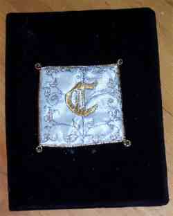
The presentation hard-covers are based on the common Tudor and Stuart practice of binding books with embroidered covers, usually of velvet or satin with gold, silver and silk needlework. According to Middleton (pg122), large areas of the velvet covers were typically left untouched because of the difficulties involved in sewing piled materials, and applique decoration was used to overcome this, as has been the case with these examples. Various leathers were also popular for binding -- goatskin, doeskin, deeskin, pigskin, sealskin, sheepskin and calfskin, with the latter most common.
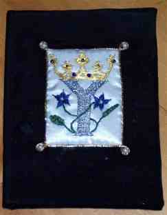
The hard-cover decorations have been based, for the most part, on the devices of the people for whom each book is intended. The embroidered Y, for Yolande, is based on the initial I developed for a broadsheet of Lady Theodora's poem for the then-Queen of Lochac, using crown and borage symbols relevant to Yolande and her lord. The embroidered C is based on a common technique used to produce capitals, whereby a border motif or woodcut area is overlain with a capital letter. In this case, the C is for Master Crispin Sexi, who provided me with ideas and inspiration regarding this approach to developing the large caps in use throughout the Tales; the motif comes from a section of Ravenscroft's Pammelia (1609) , which Crispin provided.
The hard covers use archival mounting board, comparable to the pasteboard that replaced wooden boards in the early 1500s. The signatures are sewn over tape through recessed sawn cuts to produce a flat spine, a period approach still in use in fine binding today. Although leather over cords produces the raised effect often thought of as an older style of binding, flat spines were in production in England from the 7th century, and proactively recessing cords or tapes was common in the 16th century (Middleton pg 17).
The endpapers consist of four leaves sewn in as part of the text block. Middelton says that "the outer two leaves…were often stuck together to make a stronger pastedown while the two inner leaves were sometimes pasted together to [make] the flyleaf" (pg 19). Plain endpapers were common in Elizabethan publishing, often made from waste paper or reinforced with vellum; marbled endpapers weren't used in England until 1655, as it typically lagged behind the Continent in terms of technique and practice. Using a plough (an implement somewhat akin to a carpenter's plane) to neaten the edges of the paper was reasonably common by the mid-1500s, but I've chosen not to do this. the smaller signatures of the hard covers don't really require it for alignment purposes, and the soft-covers wouldn't have warranted the additional work.
One thing I would like to have included was headbands, which were coloured silk threads, usually in two colours, used to cap the endges of the signatures within the spine for added strength and protection -- you can see them still on well-bound books today. Bookbinders began to use stuck-on headbands (rather than sewing them in from scratch) in the 16th-century, and headbands of this type are still available today. Time constraints precluded their use in this project, but I hope to learn how to make them for future efforts.
One of the presentation books has a tied closure, commonly found in fine binding from 1530 to 1640 (Middleton pg 125), when such ties replaced the heavier metal clasps associated with older, wooden covers.
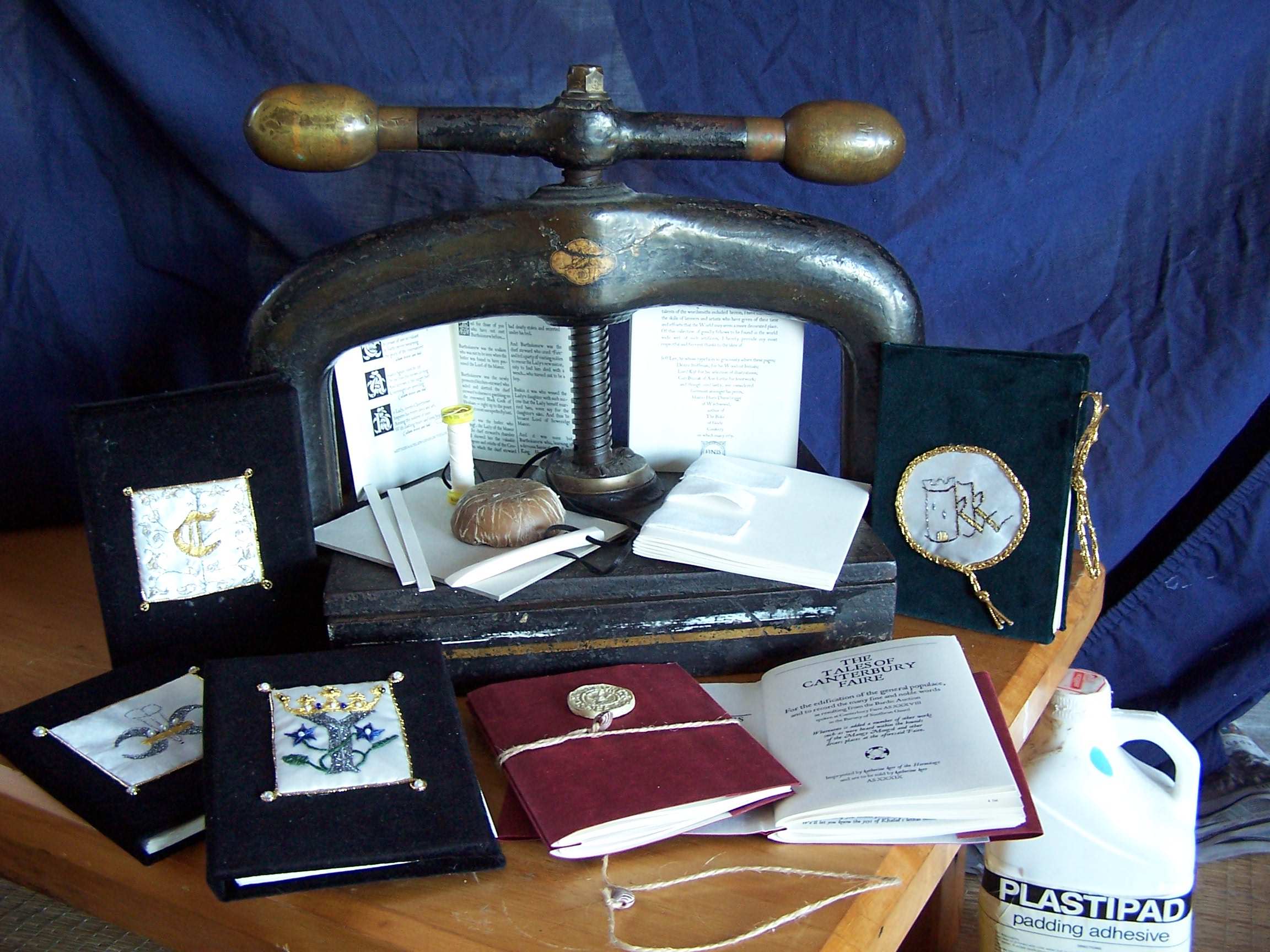
This shows some of the equipment used in the production of the Tales of Canterbury Faire, as well as the various stages of production and techniques used. Click on the image for a larger pop-up view.
On the book press plattern (at left) are the archival pasteboard and spine sections; unwaxed , unbleached linen thread; beeswax; and a bone folder (actually a Viking pendant which was the right size and shape for folding and creasing pages!). Next to these is an example of the six-signature text block (used in the hard covers) sewn with cotton tape prior to casing in. The white bottle contains book-binder's Plastipad padding adhesive. Other basic equipment not shown: newspaper, greaseproof paper, brushes, board-based sewing frame.
The hard cover editions are in velvet, with individual embroidered appliqued motifs. The one with my kk sigil (on the right in green velvet) has a tie closure, used because the test spine was cut too narrow and the book has a tendency to sit open. The black velvet books have motifs for, from back to front, Master Crispin Sexi, Baron Callum Macleod and Baroness Chrettienne de Haverington, and then-Queen Yolande. The soft-cover edition demonstrates the double-signature binding sewn directly through a folded section of the leatherette cover. The left-hand example shows the jute string strapping band with a scallop shell token (repeating the title page symbol), as well as the plaster Canterbury Faire boss.
| ||||||||||||||||||||||||||||||||||||||||||||||||||||||||||||||||||||||||||||||||||||||||||||
