 |
|
Printing: Single-Sheet Material
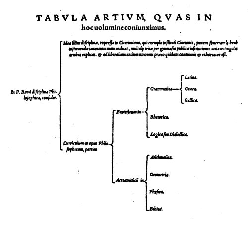
Renaissance Flowcharts A lot of my print work has involved single-sheet material -- broadsides, posters, menus and the like -- often used for specific events. It's typical ephemera, used once then it becomes a wrapper for the medieval equivalent of fish-and-chips. Renaissance Flowcharts � the Art of Structuring InformationIn the latter half of the 1500s there arose an enthusiasm for categorising knowledge into readily digestible items, partly to encouraged learning and partly towards treating the world in a logical form where one could move from the general to the specific through judicious use of new punctuation and summarisation. Nowhere is this more evident than in the thinking systems promulgated by Peter Ramus, where information was boiled down into chunks and laid out using braces and lines to indicate relationships. In his 1543 book Dialecticae partitiones, he extols the virtues of summaries, headings, citation and examples (Ong), becoming the first widely known promoter of an approach familiar to the modern reader (cf Coles Notes). This became popular as a means of teaching, whether of religious matters, legal knowledge, tax law or even approaches to poetry.
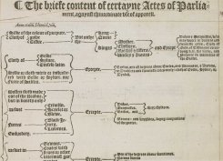
Ramism was taken up enthusiastically in some parts, if not always well deployed -- Watt refers to the English being �known for being particularly unsophisticated in their use of Ramism� (pg 240). For others, it was an overly simplistic way of thinking and, worse, looked to supplant the Ancients. Watt notes that �the habit of using these bracketed flow-charts percolated down into simpler households for an audience of �middling� wealth and 'middling' education�, and is somewhat scathing of author Charles Gybbon�s attempt to use not only brackets but ten different types of fonts to organise his scriptural precepts (pg 241). Other examples of applied Ramism include that in the 1554 medical textbook of Jacobus Sylvius, where a tabulated format is used to represent the relationship between breathing and pulse, aiding diagnoses. A University of Chicago exhibition notes that the �table is thus both a practical aid and a guide to methodical analysis�. Another item from the exhibition � Abraham Fraunce�s The Lawyers Logike, printed in 1588 -- shows this logical structure approach being used to �foster methodical thinking among English common lawyers�, and includes an analysis of the poetry in Edmund Spenser�s Shepheardes Calendar. SCA-based FlowchartsI had first encountered the chart approach in a British Library copy of sumptuary laws: The briefe content of certayne actes of Parliament agaynst the inordiante vse of apparel. For some time, I had it tucked inside my project book, thinking that it might provide an interesting model for some form of printed output, but it�s taken me a long time to figure out what that just might be. And when inspiration struck, it struck twice�. What sort of information would be suited to the logical structure of a Ramus table? We don�t have sumptuary laws in Lochac, but there are conventions obeyed by the Guild of Scribes regarding what may be displayed on an Achievement of Arms. And so my first Ramus diagram took shape, based on the Table of Achievements for Scrolls from the Guild�s 2012 Handbook. It was quite a challenge to find the right structure for the information, particularly when some of it seemed a bit illogical itself. The final output is based on the 1577 Proclamation against inordinate use of apparel, complete with blackletter text and hand-drawn braces; it has an additional sidebox using text from the sumptuary laws passed by Philip and Marie, just because the wording was so lovely.
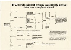
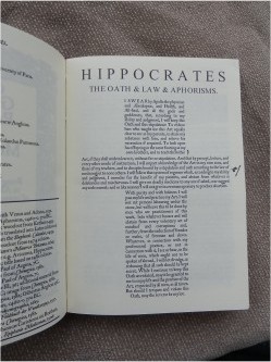
Here's the full PDF version of the SCA Achievements Flowchart. The second flowchart presents the relationship between the Banco di Don Julio and the various items and activities it funded at Canterbury Faire over the space of five years (AS445-49). Its layout is based on the Tabula Generalis, from Ramus� Dialectica, using humanist Roman and Italic fonts, with some out-denting and printed braces (the braces are taken directly from the Dialectica, and scaled). Strictly speaking, this chart does not follow the exemplar precisely in terms of providing neatly nested binary choices, but perhaps is more closely related to Gybbon�s Premonition in classifying more general information not amenable to being split into philosophik dichotomies (but without the multiple fonts). Here's the A4 PDF version of the Charted Dispersements of the Banco di Don Julio, Canterbury Faire Chamber AS45-49. It provides a gratifyingly period means of acknowledging all those who contributed to the Banco and its operations, and I tried to ensure that all the padrones and artisans who had supported Banco received a copy. References The Hippocratic OathThere was a medical topic in the Kingdom A&S selection for November Crown AS50, so I thought I'd take a closer look at the Hippocratic Oath which I'd prepared for Lady Elizabeth Braythwayte's Book of Physick.
Background The writings of Hippocrates and Galen formed the basis for medieval medical training from the 11th century onwards as more of these texts became available through translation via the Arabic world. Prior to that, the Oath had been discussed by church fathers as a contrast to the ethics of Christian provision of "medicine of the soul" (Veatch). Although clearly of Greek, and therefore, pagan, origin, Byzantine scholars modified it in the 10th-12th centuries to fit "in so far as a Christian may swear it". This included obviously changing religious references but it also led to the removal of a number of sections relating to surgery, abortion and the sanctity of the oath as a form of initiation ceremony (Wallis, pg 429; Veatch).
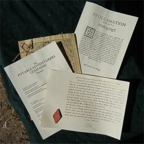
A physical approach to that Christian adaptation involved forming the oath into the shape of a cross to reinforce the change in cultural context. At least two early Byzantine manuscripts survive which show this: the Urbinas (10-11th C) and the Ambrosianus (14th C) (Jones). By the end of the 15th century, the Oath was circulating in Latin, translated by Italian humanists such as Niccolo Perotti (1483) and Andreas Brent (1490), and cited at the University of Wittenberg in 1508. The complete Corpus of Hippocrates in Latin was printed in 1525 by Calvus (Edward Worth Library), and in the original Greek in Venice by Aldus, in 1526 (Glick). English versions of the Oath started to circulate in the second half of the 1500s, with the earliest from 1566 in John Securis' A Deterion and Querimonie of the Daly Enormities and Abuses Committed in Physick (Larkey). I wanted to include the Oath in a collection of medical works I was researching for a bespoke book project, and wanted it in English so that it could be easily read. The translation is from the Harvard Classics edition, retaining the original Greek oath. The cross layout is based on the 12th-century manuscripts, most particularly the Byzantine Urbinus text, and follows the general form of printing and font as used by Aldus. (Combining the Greek text and the Christian cross is anachronistic, I know.) The title line of Iusiurandum Hippocratis (the Oath of Hippocrates) is taken from the index used in the Aldine Hippocrates of 1526, and laid out based on the title-page text of that edition, using a comparable Roman font and a shifted final period point. Gypsy ProclamationFor Canterbury Faire AS49, I was asked to produce a proclamation pertaining to the Gypsy Market, warning people against attending such a disreputable gathering. I figured it would be relatively easy to find a suitable period model, as I was aware of the long history of prejudice against "Egipcyans". There were a number of such proclamations and various Acts containing such warning, along with exhortations to exile and various punishments. One from 1577 (cited in Tyrwhit and Tyndale's Digest of the Public General Statutes, pg 337), stated this: Dyverse outlandysshe rogues, vagabonds, and sturdy beggars, using no Crafte and with Questyonabbe Merchanndyce and Devlish and Naughtie practicces going from playce to place in greate companies, wandering in the Habite Forme of Attyre of counterfayte Egipcyans and used greate sybtyll ad crafty meanes to deceyve the People that they by Palmestre coulde telle Fortunes, and commyttyng ,amy and haynous Felonyes and Robberies to the greate Hurte and Deceyte of the People that they had comyn amonge, said rogues, vagabonds and sturdy begggaris sall not be suffred to come within this Realme ; and if they do, shall forefit to H. M. all their goods, and be commanded to avoid the realme within 15 days, on payne of improsonment, and every sheriff, Justice or escheator, may seize such goods to H.M.s use, and account thereof in exchequer, and have to his own use a moiety thereof. This act shall not extend to children not above 14. It followed along the lines of the 1530 Act concerning Egipcions and similar moves in 1535, 1549 and 1555. Wording in the 1549 act implies that those who had left the realm �had enterprised to come over again�; the 1555 one included punishments for �any one importing Gypsies� Tudor Travellers, from Pre-Elizabethan England. I was interested to find that Scotland had apparently passed similar laws, as numerous gypsy or traveller sources referenced an Act of Stringency passed in 1571 (see, for example, the Scottish Gypsies website). However, I couldn�t find any actual record of such an Act in the records of the Scottish Parliament. I based the final proclamation on the 1577 wording, titling it the Proclamation of the Act of Stringency, as follows: Dyverse outlandysshe rogues, vagabonds, and sturdy beggars, using no Crafte and with Questyonabbe Merchanndyce and Devlish and Naughtie practicces going from playce to place in greate companies, wandering in the Habite Forme of Attyre of counterfayte Egipcyans and used greate sybtyll ad crafty meanes to deceyve the People that they by Palmestre coulde telle Fortunes, and commyttyng many and haynous Felonyes and Robberies to the greate Hurte and Deceyte of the People that they had comyn amonge, said rogues, vagabonds and sturdy begggaris sall not be suffred to gather in publick places nor peddel their wares and dubyous trades to subjeckts of this Realme / moste especially not behinde the arming pavillions during the revel of a Monday e�en / on Payne of Improsonment, Forfeiture of Goods and Banishment of the Realme. It was laid out as per standard posted late-period proclamations with a large initial capital and ending with God save the King. We posted a copy on the Market Cross and I think it was read aloud to close the Gypsy Market.
PlaybillsI have printed playbills for the Half-Circle Theatre at Canterbury Faire, and for Master Steffan Glaube's Mandragola play at Rownay Festival. Here are the PDFs, sized for three to an A4 sheet to get the right kind of proportions.
Half-Circle Theatre (PDF A4) RoundelsI've been intrigued by the Elizabethan roundels, thin wooden (sometimes just varnished paper) placemats. The examples I've seen have poems or verses with an illustration. They were typically handed out in box sets, very much like the cork placemats elderly aunts today invariably give as wedding gifts. I like the idea of producing a set for personal use, as well as possibly producing a set for a feast, with the menu on one side and songs on the other. I'm still in the experimental stage with these, looking for suitable artwork or artwork styles. I think they'd be very handy as an encouragement to singing for the hundreds of songs we know the chorus to but can only stumble through the verses. (The example shown here has the verses for Greensleeves.
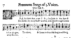
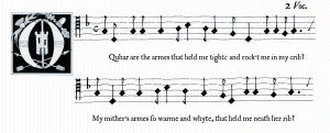
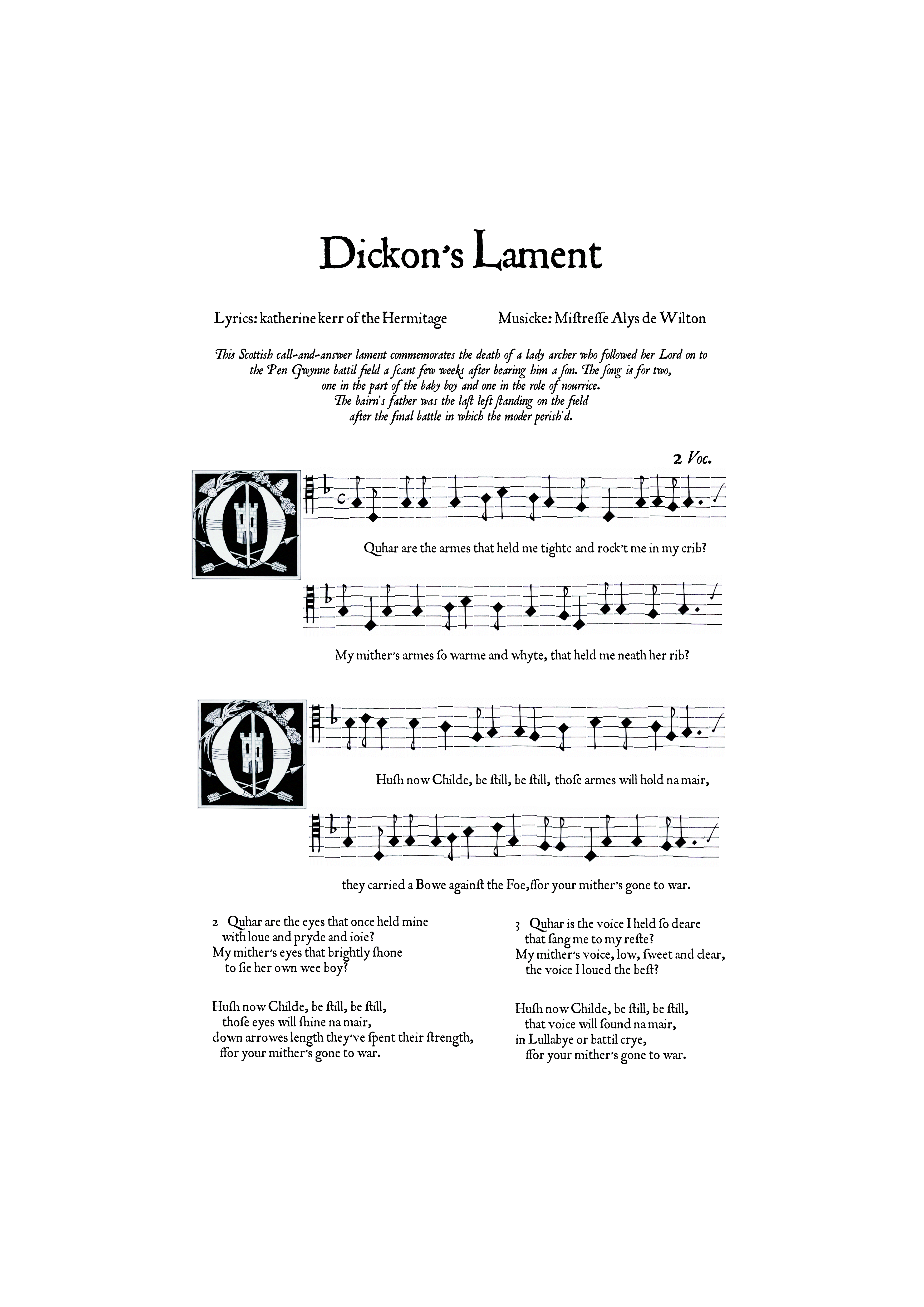
Dickon's Lament - a printed 16th-century broadsheetYou can read about the song itself and its background here. This section deals with the actual production side of the song as a broadsheet. Printed music, in the form of single-page woodcuts, came into being in the latter part of the 1400s. The development of movable type made it viable. By the 1520s, music fonts were created with each piece of type having a note, or other musical symbol, along with a section of the stave (Gaskell, 1972: 138-39). Close examination of such music (eg Ravenscroft's Pammelia, 1609; the Sibley Music Library collection) shows this approach in use. The reversal of the beams ("tails") of the notes also suggests that, in order to save on the number of different slugs required, printers simply inverted notes to double their usage. While metal-based type allowed for much greater resolution, leading to thinner, smoother staff lines than possible with the earlier woodcuts, lining up the type proved to be a problem, as Pammelia and other examples clearly demonstrate. Honea notes, in discussing the Antwerp publication of Souter Liedekens by Symon Cock (1613): The compositer used so-called "vertical" type, in which single notes founded on complete sections of staff are compiled together with other blank sections of the staff in various widths to form a single impression. In this example each piece of type does not always align neatly with its neighbor, resulting in a visually "jerky" flow of the musical line. This effect has been reproduced in Dickon's Lament by hand-drawing the note types, scanning them and then assembling them electronically as individual slugs. The general layout is comparable to that of Pammelia, without exactly reproducing Ravenscroft's format - the initial capital, for example, has been made somewhat larger, and without left justification; this was purely a design decision. The symbology within the capital has been selected for its references to the lament (bow and arrows; the Hermitage tower; Scots thistle and acorn), rather than simply reproducing a period capital.
The music itself is in white mensural notation, a precursor to modern musical notation with some distinct differences, most obviously in the diamond-shaped heads of the notes. The "railway line" clef mark at the start of each line indicates the position of C. At the end of each line, the "tick" indicates the pitch of the note at the start of the next line; a convenient assistance for the sight reader.
Except for the title, which is in Buccaneer (a Scriptorium font), the typeface for the lyrics is in JSL Ancient, as developed by Jeff Lee based on the transitional typefaces used by English printers Edward Jones and J. Redmayne in the latter part of the 1600s. While outside the SCA period, they are very close in style to the typeface used in Pammelia and in earlier print examples. The text has been run through Lees' JSL Font Convertor to produce the ligatures and special characters used at the time. The period spelling and Scots usage (eg quhar for where) has been based on original source material such as ballads and letters from the latter half of the 16th century. The paper is a high-rag content paper cut to 15" x 10" (375 x 250mm), the size which formed the typical standard folio sheet or broadside. Gregory Blount of Isenfir (Greg Lindahl) refers to this size with regard to a printed broadsheet reproduced by Holbein. It also makes a good presentation size for gift purposes on the occasion of Alys de Wilton's elevation to the Order of the Laurel. Postcript The other error is an incorrect note in the final stave. I could redo the whole thing or accept it as an example of "the Matty Groves effect" (ie tunes and lyrics changing over time through errors of written and oral transmission). I've tried singing it the "new" way and it sounds acceptable, so I'll leave it for the moment. Perhaps I'll do that when I put it into modern notation, which I'd like to do, adding the bass drone part where my harp gets to imitate a bag-pipe (what a cruel and unusual punishment for such a nice instrument!). Bardic BroadsheetsAs part of the Bardic Auction in AS38, I helped bulk out the patron prize pool with a number of promissory notes for broadsheets: Let it be known that the holder of this note, in recognition of their furthering of the arts and entertainment at Canterbury Faire through their patronage of the Bardic Auction, is entitled to the following: I ended up doing three broadsheets for bardic patrons, adding suitable embellishments:
Here the version I did for the poem honouring the then-Queen of Lochac, Yolande Kesteven. The pseudo-woodcut capital I made incorporates borage flowers as a symbol, as well as the Crown. When I came to save this as a PDF, I had to take out the ligatures and long s character used in the original. This is the non-illuminated version.
| |||||||||||||||||||||||||||||||||||||||||||||||||||||||||||||